


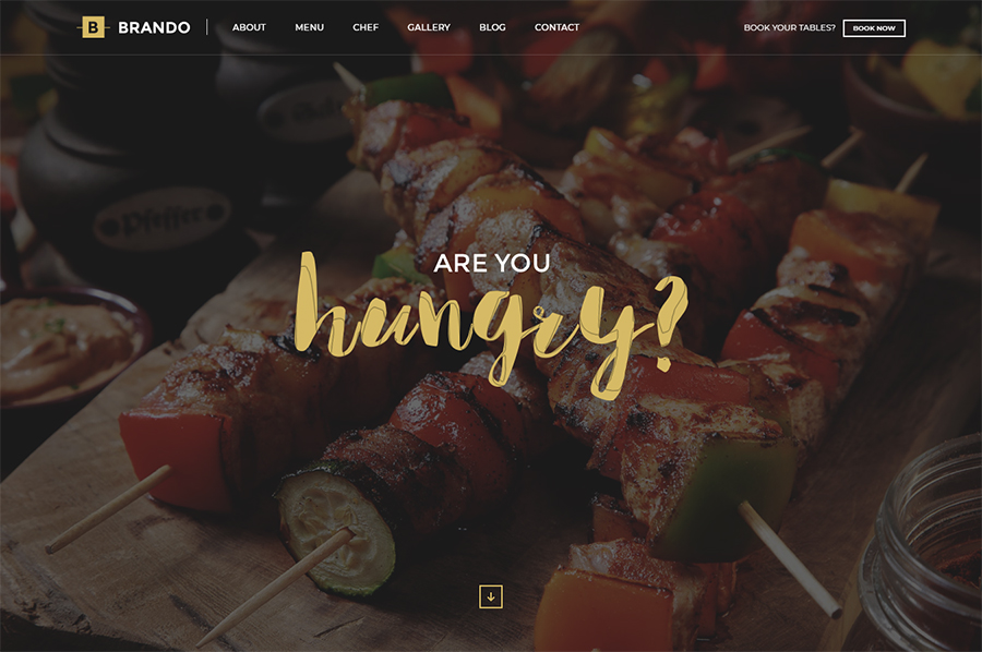
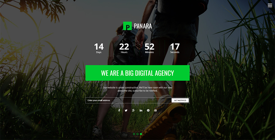
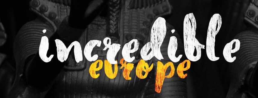
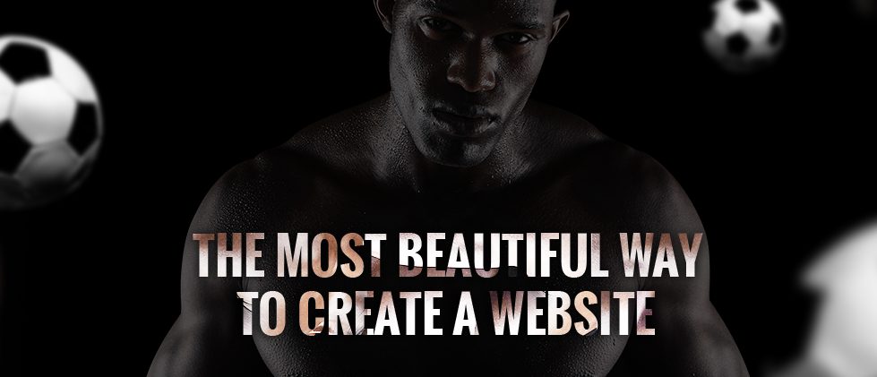
Brando is a fully responsive, creative, clean, beautiful and multipurpose onepage template with latest web
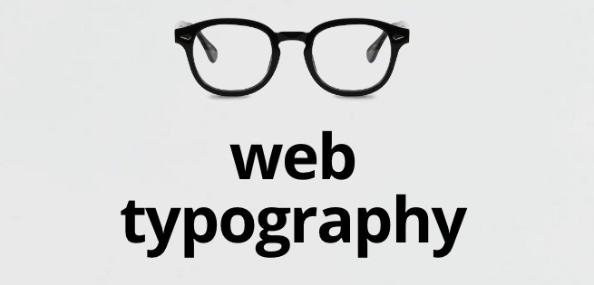
Typography does not just mean selecting the right font for your website, it refers to a lot of other things that are crucial for ensuring your site’s success. Features such as Alignment, Visual Hierarchy, Readability and Content communication are all covered under typography. It is the sole responsibility of a web designer to take care of all these website elements in a well-organized manner. If you too are from a web designing background and aren’t familiar with the basic guidelines that need to be followed for effective web design typography then you’ve reached the right place.
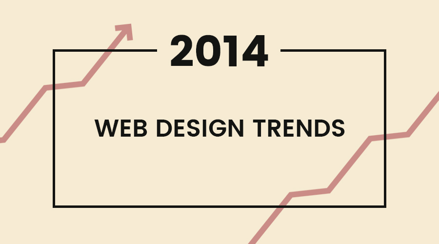
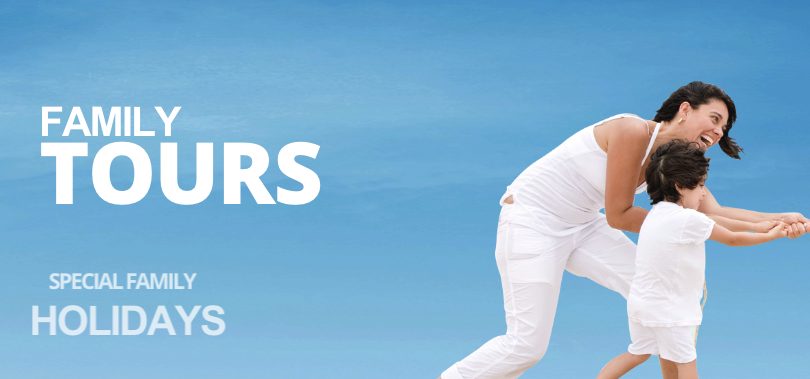
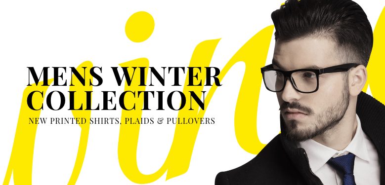
Responsive Web Design isn’t just about columns, grids, images and icons. All of this will not make sense without text for content. When it comes to content, we need to talk about web typography. Looking at modern web design trends, having responsive typography is a big factor every web designer and web developer shouldn’t miss.
Typography Basics
Good typography is all about selecting the right type for web or printed media. From font type, color of the text to the length and font-size on different viewports, good typography ensures that the final letter forms generate the highest quality end result.
Typeface
Also known as font family. This is a collection of design of characters with a complete set of letters, numbers, symbols, special characters and weight.
Font
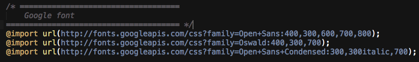
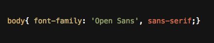
This is the actual computer file that contains information about the lettering used, such as typeface, weight, width, style and so on. you can use any font that is available on the hosted web font site such as Google Font, Typekit and Fontdeck.
Baseline
This is the line where the letters rest and where descenders extend.
Cap Height
This is the height of the capital letters above the baseline.
X-height
Also known as corpus size. This to the distance between the baseline and midline (half the distance from the baseline to cap height)
Descenders
This is the part of a letter that extends below the baseline.
Tracking
Also known as letter spacing. This is the consistent increase or decrease of space between letters uniformly.
Kerning
The process of adjusting the space between individual characters in glyphs of varying widths.
Leading
Also known as line height in CSS. The distance between the baselines of successive lines or types.
Points to Consider on Web Typography
Below factors that can help you create presentable web typography.
– Choose the best typeface that corresponds to your topic or content
– Use web fonts
you can use any font that is available on the hosted web font site such as Google Font, Typekit and Fontdeck. Here are the following the advantages of using web fonts:
It saves money. You don’t need to purchase fonts online.
It saves time. While you can integrate fonts manually in your folders file, using web fonts can be done with a line of code.
They are compatible on all new versions of web browsers and are SEO-friendly.
– Use best and proper color combinations
Remember good web design can be identified by how well the site functions and how good the design is.
– Use text content instead of images
As we all know images make web pages slower. Most often images are the only way to force the web browser to display a preferred font and the exact layout you want.
Best Typography, Responsive & Bootstrap Templates
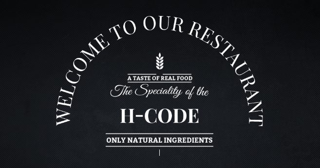
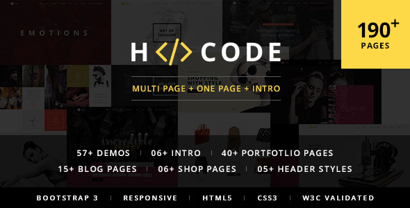
H-Code | Multi-Purpose One/Multi Page Template
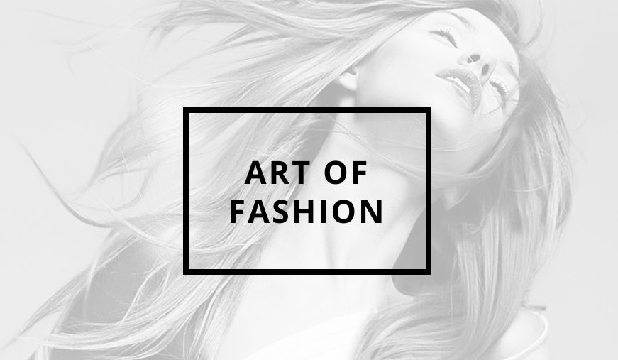
H-Code is a responsive, creative, powerful and multi-purpose multi page and one page template with latest web design trends. It is multi-purpose professional template for any business like design agency, fashion, architecture, spa, restaurant, travel, corporate, photography, ecommerce, personal resume, wedding, product / service, etc… with readymade templates and portfolio options for quick start of their online presence with awesome portfolio. It is developer friendly to customize it using tons of layouts, portfolio options, shortcodes and much more with SEO & Speed optimized, well documented, commented, structured and easy to understand code.
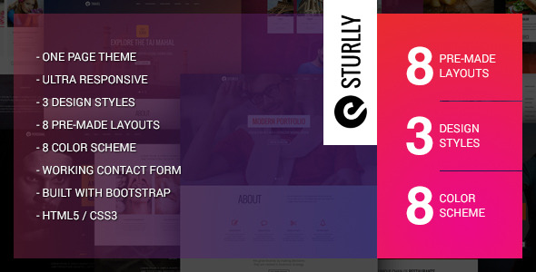
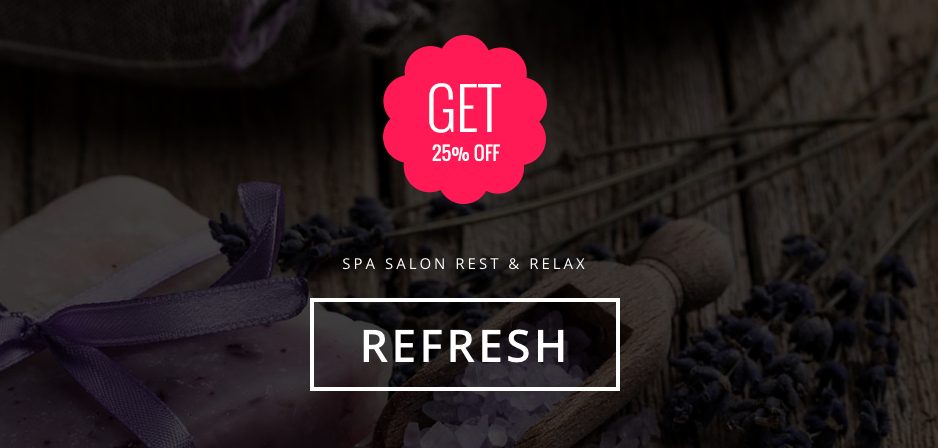
Sturlly | Responsive One Page Multi-Purpose Template
Sturlly is a creative, clean and professional one page responsive theme. It contains different options, pre-made layouts for different businesses and other extra pages like blog and coming soon. It is well designed, tested, documented, easily customisable and really perfect fits for businesses like SPA salon, fashion, restaurant, travel, interior, architecture, design agency, personal resume and many more…