LeadGen - Multipurpose Marketing Landing Page Pack with Page Builder
- Download LeadGen at: https://1.envato.market/vvB0d
- Created: 6th Jan 2017
- Last Updated: 3rd Jan 2024
- By: ThemeZaa
- Email: info@themezaa.com
Thank you for purchasing & using LeadGen - Multipurpose Marketing Landing Page Pack with Page Builder. If you have any questions that are beyond the scope of this help file, please feel free to create a support ticket here: https://www.themezaa.com/support/. Thanks so much!
We love to hear your feedback - if you find any bugs or have suggestions for improvements please get in touch.
If you like this template, please remember to rate it on Themeforest - it really helps us to know what people think about our templates. To rate this item, go to your Downloads page on Themeforest, then next to this template click on a star rating you'd like to give us.
Thank you so much.
ThemeZaa Team
What is LeadGen?
LeadGen is a conversion ratio and speed optimized multi-purpose marketing landing page template with drag & drop page builder and tons of readymade elements and demos with greater level of customization possibilities.
Modern and Responsive Multi-Purpose Marketing Landing Page Template With Drag & Drop Page Builder
LeadGen is the best collection of landing pages with modern touch, very well polished, highly responsive, elegant and engaging marketing pages to attract your readers and convince them to contact you or convert to your prospect using the form and call to action buttons. LeadGen can be used as one page website also by having OnePage smooth scrolling menu linked to various sections added on the page.
There are 35+ carefully crafted readymade demos are available for different type of businesses as well as 300+ unique elements to chose from and generate your own landing page quickly without any hassles. A powerful and intuitive drag and drop page builder worth $29 is integrated to use readymade blocks, customize fonts, colors, links, styling, content, images as well as deep customization using source code also.
LeadGen is built with best coding standard and practices to make it visible to search engines as well as speed optimized and having SEO meta data feature for the pages. The code is very clean, structured and commented to make it more convenient to customize the elements using source code editing if needed.
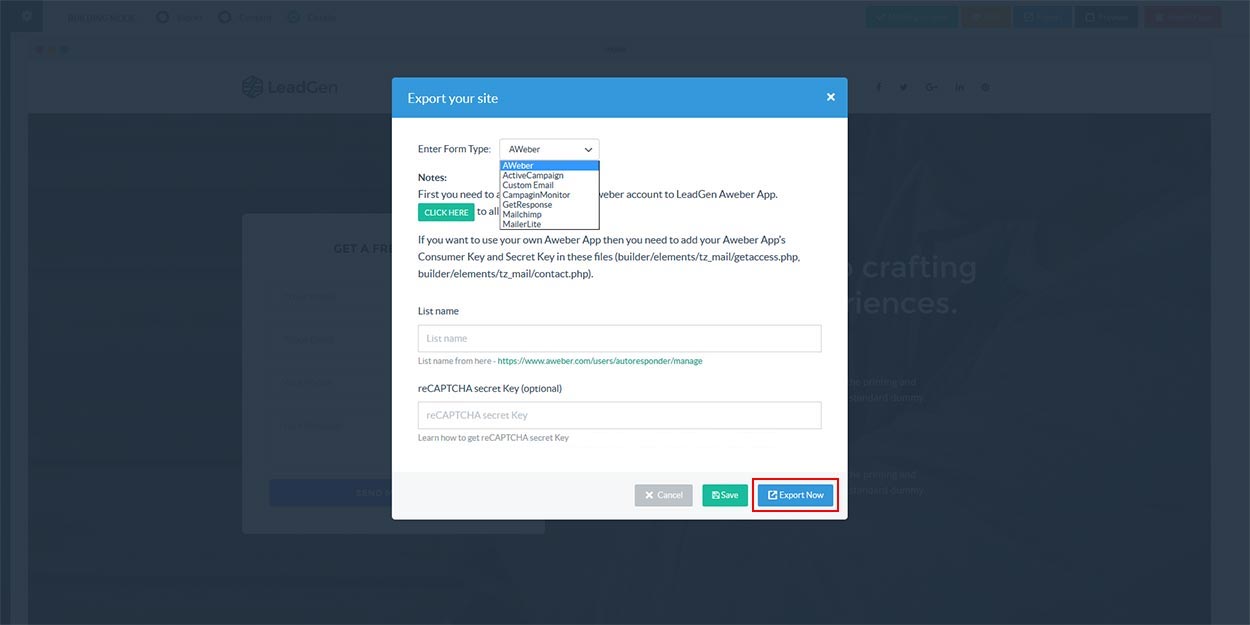
Import / Export is the great feature implemented to save your work as JSON file and later you can import it also to continue working on the same project. Once your page is all done you can easily export the page to have final files and you can then host files on your server to make your awesome page live. The heart of the landing page is lead generation using forms and that is very well taken care by having lots of readymade forms with data validation and also those can be integrated easily with your lovely desired email managing platforms like AWeber, Mailchimp, Active Campaign, Campaign Monitor, Get Response, Mailer Lite as well as custom form to email. We didn’t forgot to provide Google Captcha integration in forms for security and to stop spams.
LeadGen Core Features
- 35+ attractive, elegant, stylish and cutting edge pixel perfect readymade landing page demos
- 300+ smart and polished, deliberately designed, beautiful and easy to use readymade elements
- Wonderfully and highly responsive to make the pages look extra ordinary and beautiful in all devices using Bootstrap responsive framework
- Built with HTML5 and CSS3 purely
- Fully retina ready to have the best visual quality in retina devices
- OnePage menu navigation feature is integrated with smooth scrolling to make one page website
- Video and image backgrounds to have attractive blocks
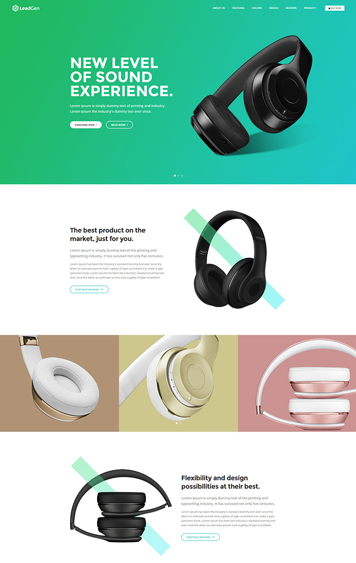
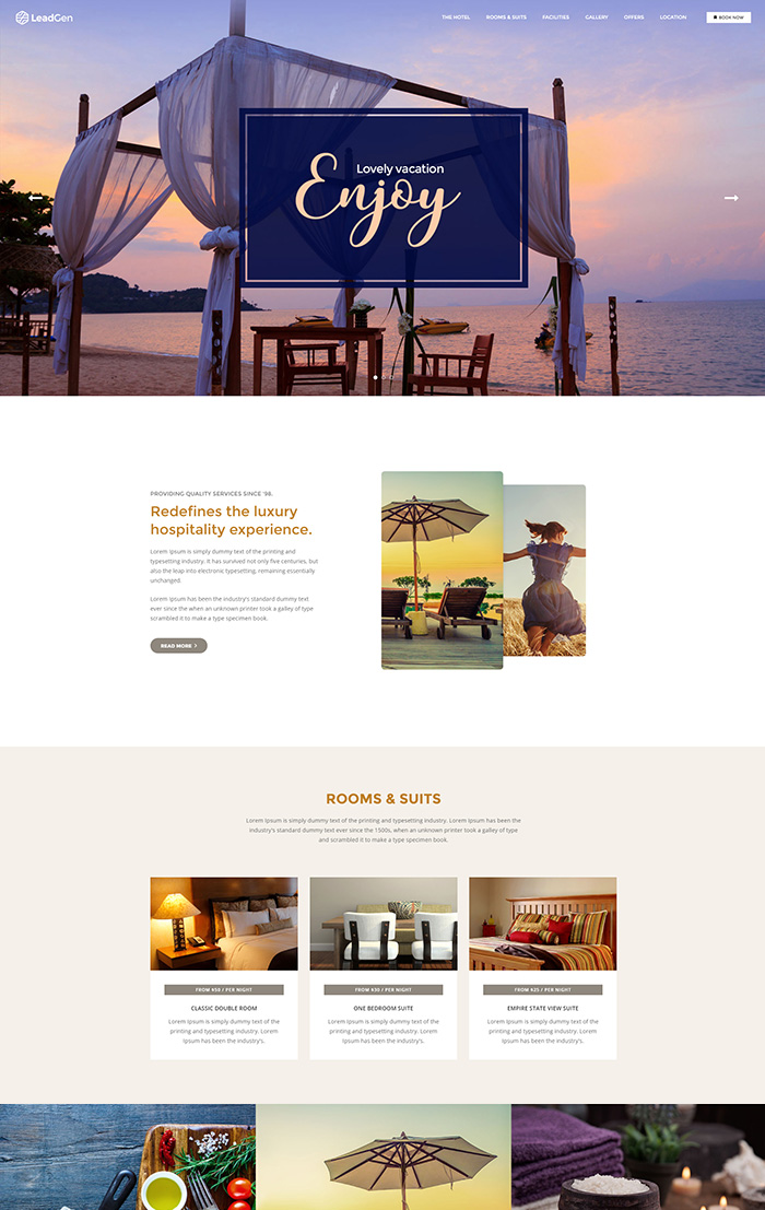
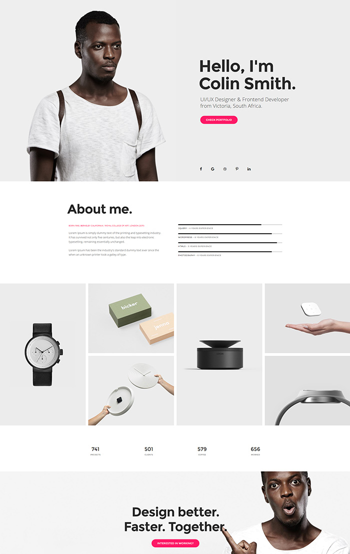
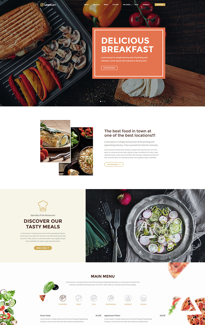
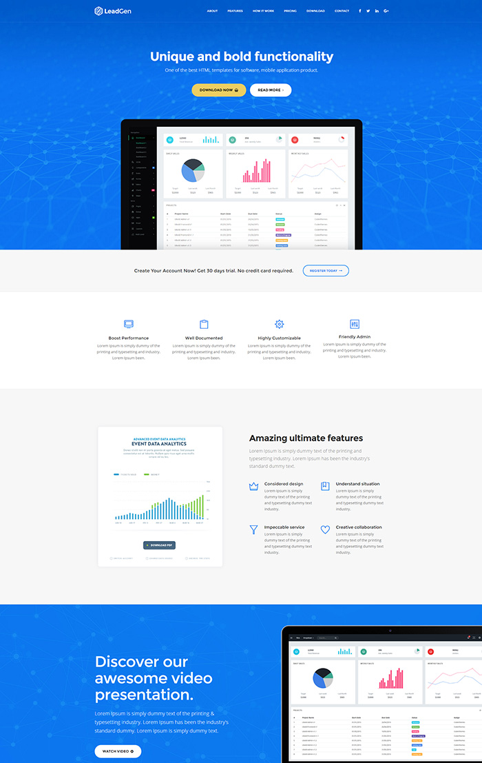
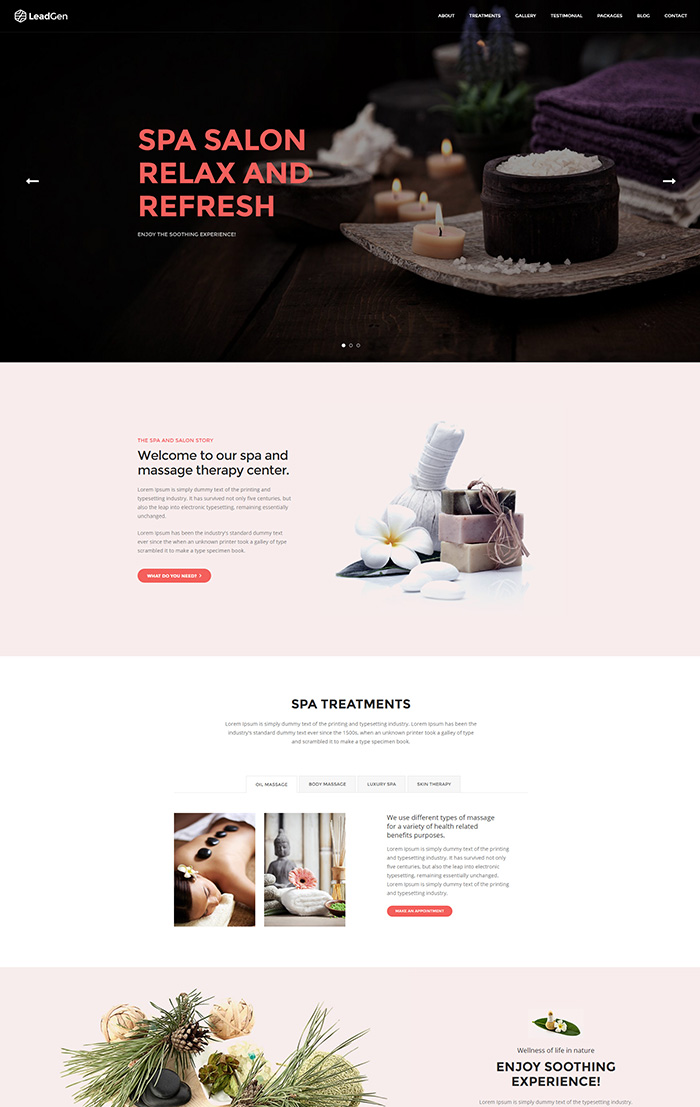
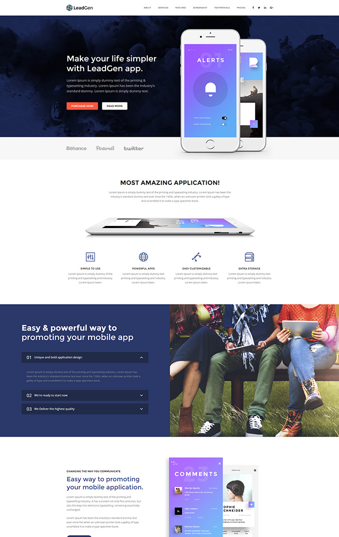
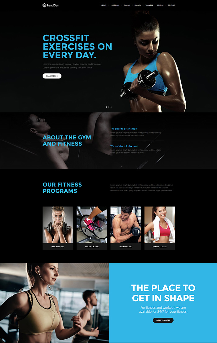
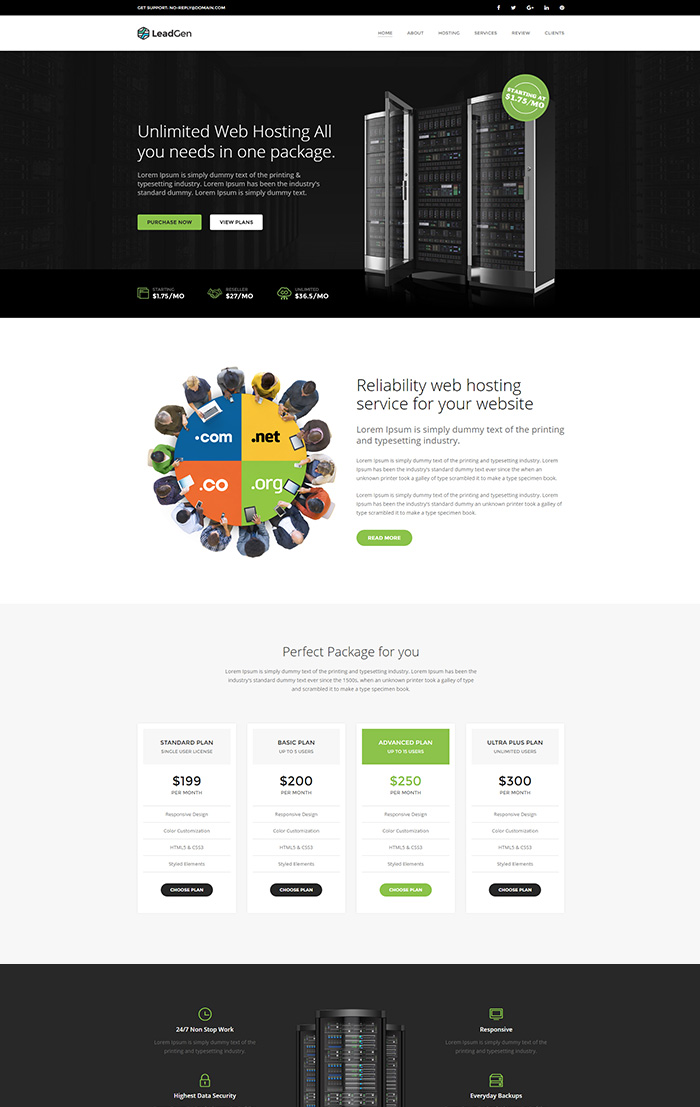
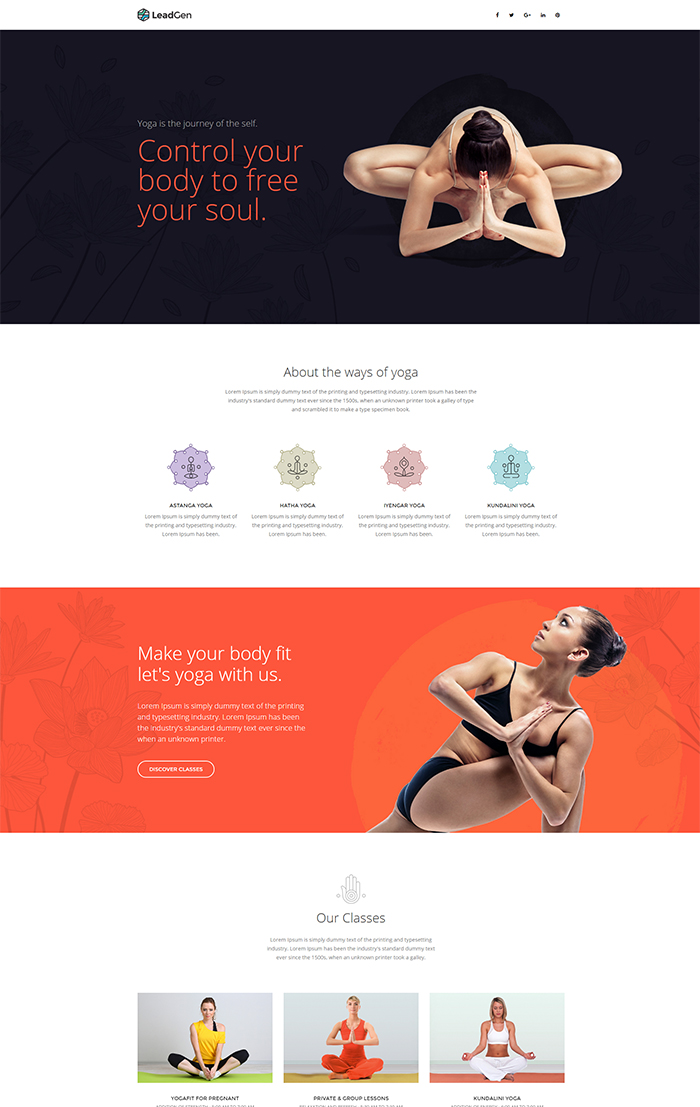
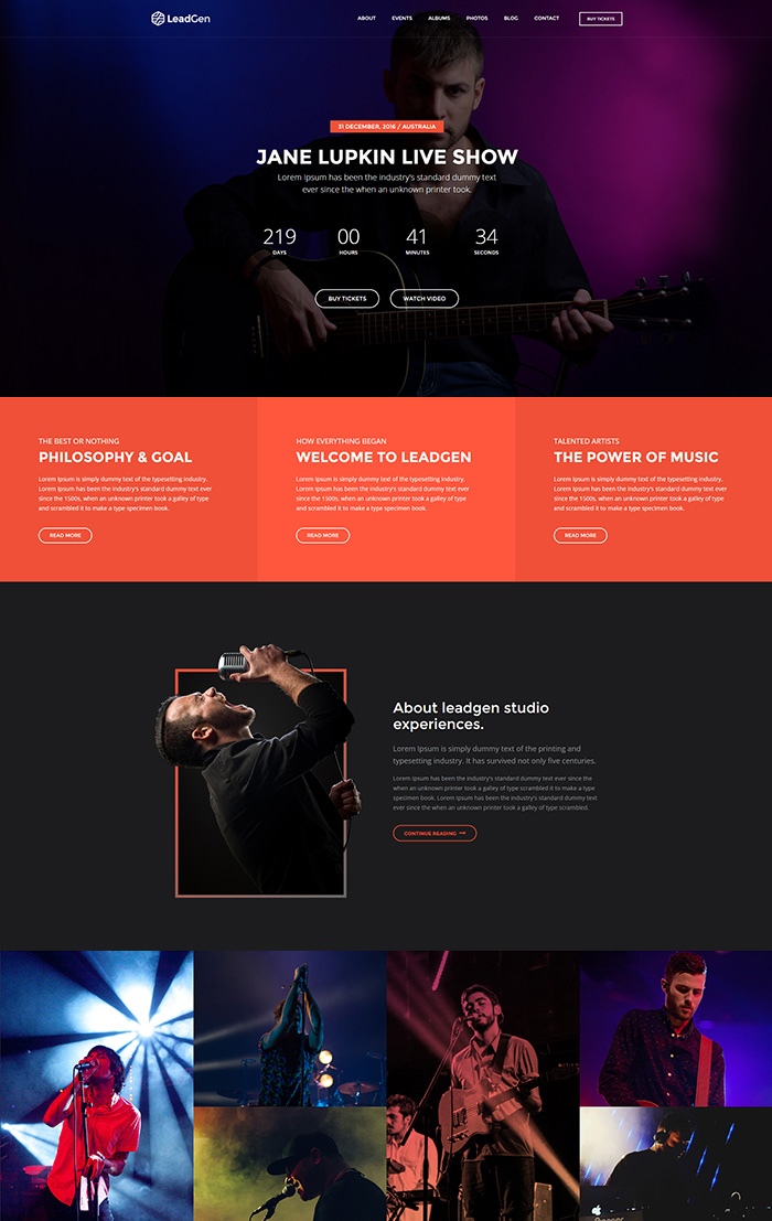
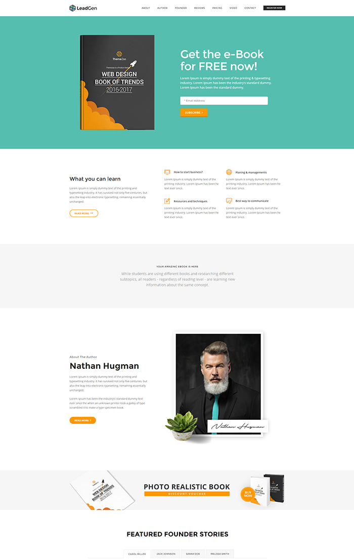
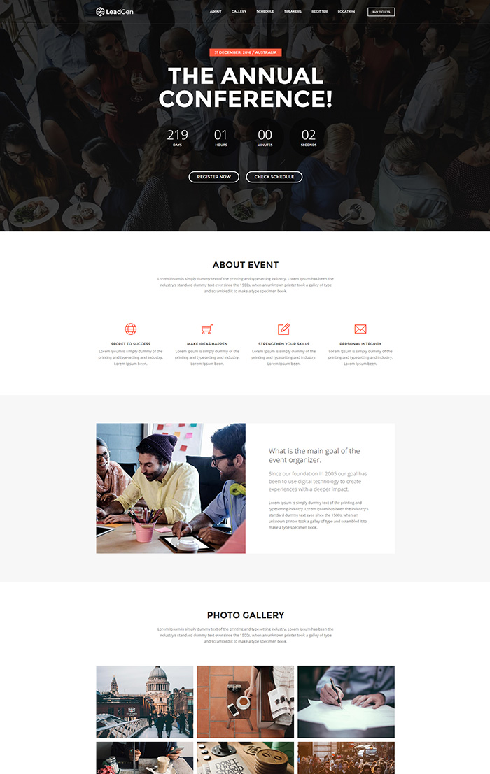
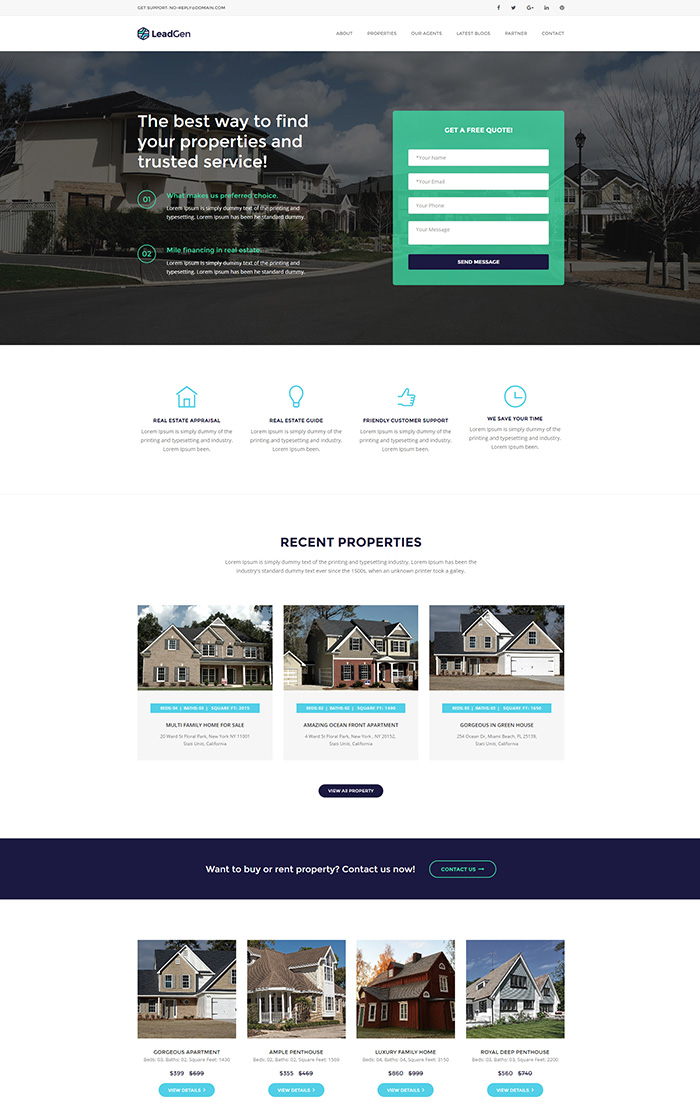
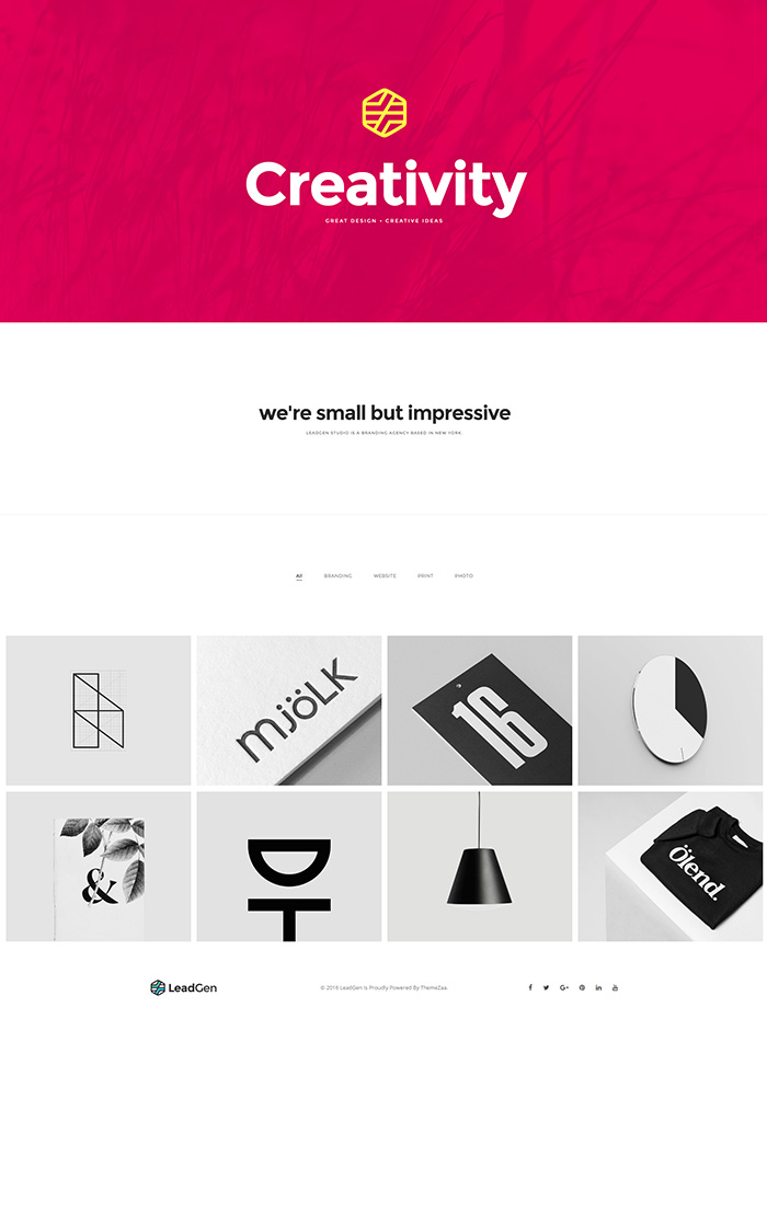
- Truly multi-purpose landing page template with readymade demos like product page, hotel and resort, personal resume, restaurant, corporate business, interior design, software tool, spa saloon, travel agency, Application launch, design agency, start-up business, E-learning, sports and gym, SEO and marketing, wedding invitation, hosting, online shopping, yoga and fitness, music show, finance and account, E-book, Event, Medical, real estate, simple portfolio, digital marketing, inner content page, simple sign-up, 404 not found and coming soon.
- Different header with static sticky feature and footer layouts
- Integrated crisp and beautiful Font Awesome and Themify font icons
- SEO and speed optimized clean and clear code with best standard practices
- All the elements and pages are well tested in all devices (desktop, tablet and mobile) as well as various browsers (IE 10+, Chrome, Firefox, Safari and Opera also) to make sure it works and looks better everywhere
- Detailed documentation and video to make it easier to setup builder, use the builder features to have your landing page ready quickly with your desired layout and quality
- Quick and responsive 5 star support from highly experienced team of our experts
- It is simple go for a non-technical person also and developers can do deep customization also as per their need easily
- Google fonts as well as your custom font can be used as per the guidance provided in the documentation
LeadGen Core Elements
- 22 various different header styles and layouts with logo, menu, call to action and social media icons
- 7 beautiful slider styles to showcase your product / service or convey your important messages
- 28 hilarious hero sections with mixture of content, images and call to action to make your user quickly aware about your purpose
- 52 attractive and easy to read content blocks
- 36 fantastic looking features box styles to represent your features with icon or images and content
- 15 awesome title and text styles to build clean overview of the section
- 7 highly intuitive tab and accordion styles to compact your longer content in small space
- 11 professional and enticing portfolio grid and masonry with category filters as well as Zoom in / out and Lightbox gallery
- 9 elegant video block styles with background video, video popup and on the page video to show your reel or video testimonials
- 7 vibrant and realistic counter styles to display date counter or your statistics
- 11 visually seamless team members listing block styles
- 6 clean and very attractive pricing table styles to showcase your pricing plans
- 10 eye catchy and clearly visible call to action block styles
- 4 clean and simply client logo grid and slider styles
- 7 visually appealing and smooth blog list styles which can be used for other purposes on top of blog article listing
- 17 impressive and cutting edge testimonials block style with slider feature to show what your clients say about your product / service
- 9 robust and classy subscription form styles to ask your users to register their interest or subscribe for your newsletters
- 8 fresh and engaging social widgets block to show twitter feed, social sharing and social media profile linking
- 20 visually stunning and extremely user friendly contact form styles with different data fields and required field validation
- 18 impressive and stunning footer block styles with simple and multi columns structure
LeadGen Builder Features
- HTML drag & drop page builder worth $29 included in the template package
- Very easy and quick to update content, images, videos, etc…
- Change font, size, color, weight of your content for all the sections or elements used in the page
- Change link options like internal page, section on the same page with smooth scrolling and external page / url
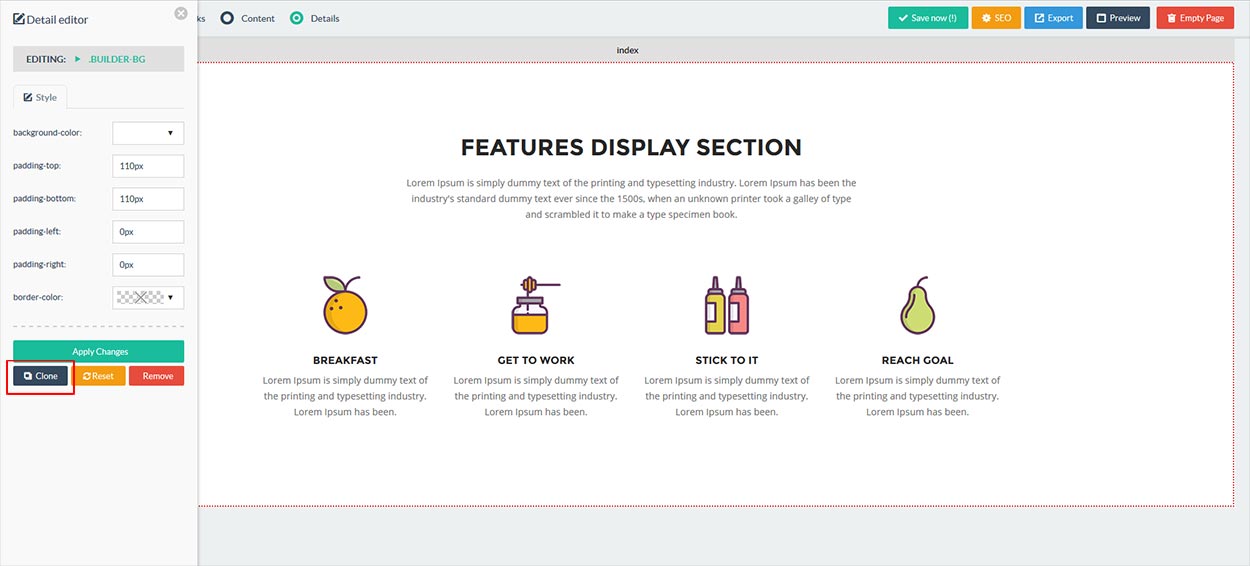
- Reset, clone and remove any section or element
- Drag & drop any section vertically to order them as per your need
- Source feature for every element where source code can be changed to do deep customization which cannot be done using page builder settings or some code which works using JS as per the documentation
- Create multiple pages in one session in case if you want to build normal content pages or others like 404 not found, sign-up, coming soon, etc… to have full website also
- Preview your page to see how it looks with your changes
- Integrate twitter real-time feed of your own profile
- Export your project as JSON file and that can be imported again to continue working in the same project without loosing your previously completed changes
- Export your landing page to have the full working package which can be uploaded to your hosting server to make your landing page live
- Add SEO meta data like title, keywords, author and description details
- Integrate the form with your desired email marketing tools like AWeber, Mailchimp, Active Campaign, Campaign Monitor, Get Response, Mailer Lite and custom form to email
Requirements
Please check below items before start working with LeadGen Builder or demo pages:
- PHP 5.4 +
- PHP ZIP module for export zip archive
- Apache WebServer
- PHP Mail Service - Enabled
- JavaScript in the web browser - Enabled
- FTP Tool - To upload files on your hosting server
Installation
Unzip the downloaded file from ThemeForest to the local disk on your computer. Inside the extracted folder there will be below folders. You can start working with demos (HTML Templates) or create your awesome HTML pages using LeadGen Builder.
Builder- LeadGen HTML Page BuilderPredefined Builder Demo Files- LeadGen Builder Demo JSON files, Simply import this demo files in LeadGen page builder and start editing pages.Demos– All readymade demo packages.Documentation- Online documentation for LeadGen - Multipurpose Landing Page Pack with Page Builder.
NoteIn this archive the images that you can see in demo pages were replaced by placeholders.
Demos
LeadGen offers creative 35+ pre-made landing page demos for different industries and some other pages, choose the landing page you like from the list below.


HTML Page Builder
HTML Builder is a nifty little Javascript application which allows end-users to easily compose custom HTML designs using pre-defined HTML elements. The HTML Builder script comes with several sample HTML elements (the ones as displayed in the live demo), however the script really shines when used with your own custom HTML elements!
NoteHTML Builder is not a CMS (content management system). It does not provide a way for end-users to work on live websites and make changes to such websites.Installation
Installing the HTML Builder is simply a matter uploading the "builder" folder to a local server/hosting account. Once uploaded, point your browser to builder's directory and the builder will work fine.
For example: http://www.yoursite.com/builder or http://localhost:8888/builder (if you run it locally on your local server).
NoteDon't upload the ".zip" file you downloaded from themeforest directly to your server, first unzip it, then upload the folder "Builder" which is inside it.Builder Features
- HTML drag & drop page builder included in the template package
- Very easy and quick to update content, images, videos, etc…
- Change font, size, color, weight of your content for all the sections or elements used in the page
- Change link options like internal page, section on the same page with smooth scrolling and external page / url
- Reset, clone and remove any section or element
- Drag & drop any section vertically to order them as per your need
- Source feature for every element where source code can be changed to do deep customization which cannot be done using page builder settings or some code which works using JS as per the documentation
- Create multiple pages in one session in case if you want to build normal content pages or others like 404 not found, sign-up, coming soon, etc… to have full website also
- Preview your page to see how it looks with your changes
- Integrate twitter real-time feed of your own profile
- Export your project as JSON file and that can be imported again to continue working in the same project without loosing your previously completed changes
- Export your landing page to have the full working package which can be uploaded to your hosting server to make your landing page live
- Add SEO meta data like title, keywords, author and description details
- Integrate the form with your desired email marketing tools like AWeber, Mailchimp, Active Campaign, Campaign Monitor, Get Response, Mailer Lite and custom form to email
Drag and Drop
HTML Builder allows users to drag HTML elements onto a canvas and drop them where they'd like them to appear. Once dropped onto the canvas, the position can be changed by dragging and dropping as well. Elements can be delete individually or all elements on the current page can be deleted in one go.

Content Editing
The HTML Builder script can also be used to edit written content inside each element (simply by setting the "building mode" to "content"). HTML Builder uses a rich text editor, allowing to make changes to the written content. Depending on what type of element you're editing, certain options will be disabled in the editor. Editable text elements will need to be configured through "/js/builder.js", and depending on the exact configuration, certain text elements might not be editable.
Style / Detail Editing
The HTML Builder script also allows for basic CSS editing and link editing. Using the built-in CSS editor, end-users can customise whatever CSS attributes the script's admin has configured. When editing a link, the end-user can point the link to either an internal page or an (external) URL.

Link Editing
The HTML Builder script allows user to edit links as well. To be able to edit links, firstly the link selectors will need to be added to the "editableItems" array in the /js/builder.js file. To edit links on the canvas, firstly select the "Details" building mode, this will allow you to select links. When selected, a "link" tab will be visible in the left panel, allowing you to either choose a page to link to or enter a URL manually.

Linking within a single page
When building a one-page website, you might want to link to sections within a single page rather then to a separate page. To do this, please follow below steps.
Step 1: Select building mode “Details” and click on element like button or link.
Step 2: Select a block ID to link from “Choose a block” drop down. The Block ID's to which can be linked, have to be configured within the block HTML files, and the ID attribute should be assigned to the first child element of the main container (for an example, please have a look at any of the bundled block files).
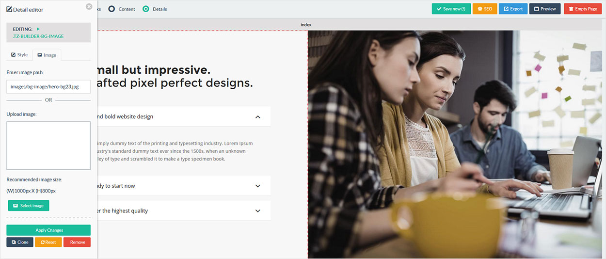
Image Editing
The HTML Builder script allows user to edit images as well. To edit images on the canvas, firstly select the Details building mode, this will allow you to select images. When selected, a "image" tab will be visible in the left panel, allowing you to either upload an image or enter a URL manually.
- To change the image, You can either add directlly full image path like http://www.yourdomain.com/image.png in "Enter Image Path" textbox or you can upload image directlly from your local computer.
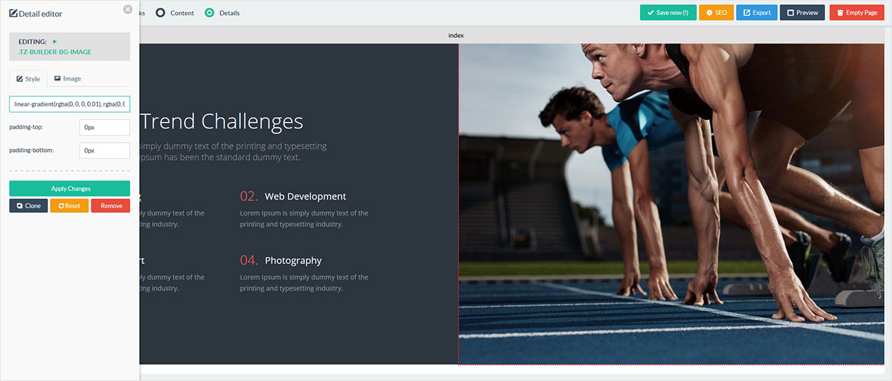
Background Image
HTML Builder allows users to edit background image as well. To edit a background image, switch to "Details" building mode and click the image you'd want to edit. This will open the left sidebar panel where you can enter image path or upload image using Image tab. You can also change background image using Style tab - background-image text option, you can also change linear-gradient here.
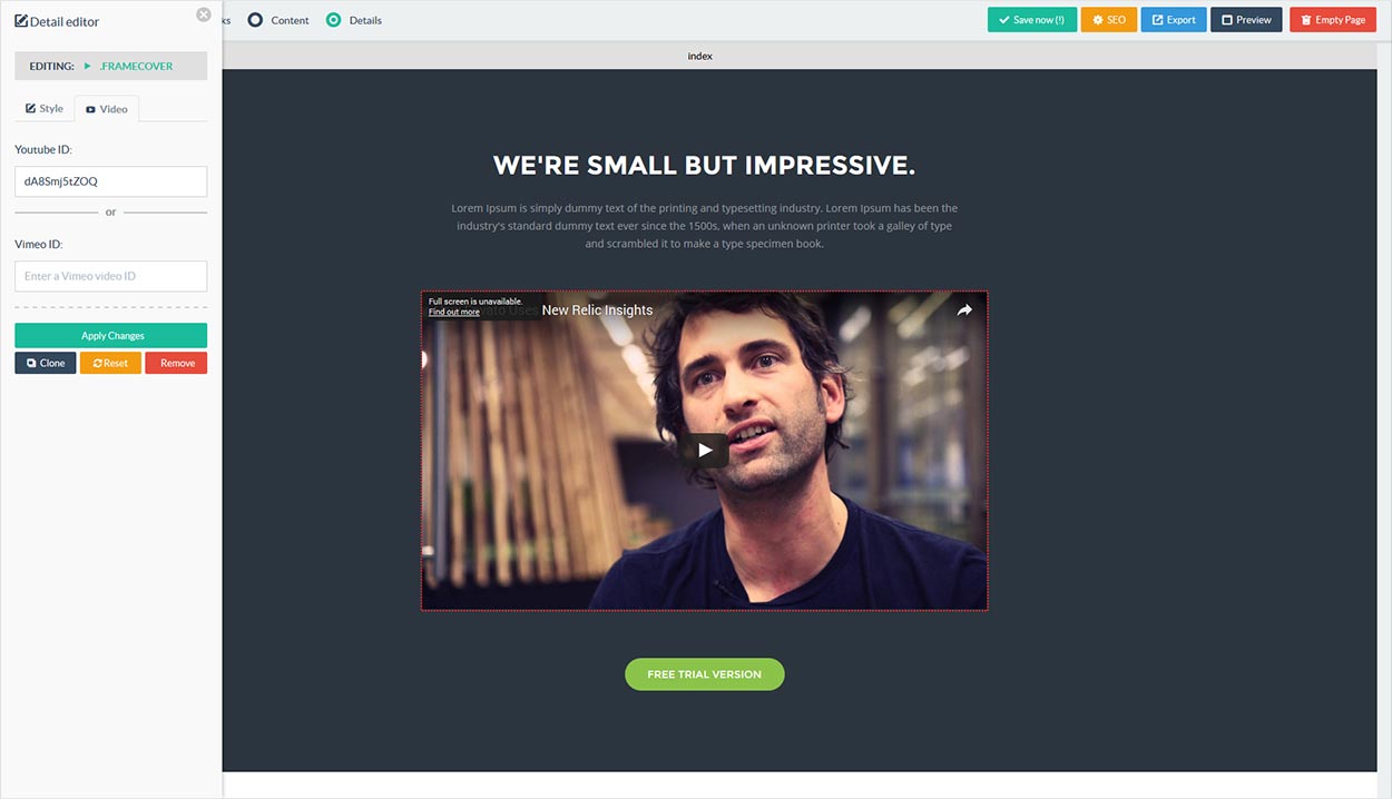
Video Editing
HTML Builder allows users to edit Youtube and Vimeo videos as well. To edit a video, switch to "Details" building mode and click the video you'd want to edit. This will open the left sidebar panel where you can enter a Youtube video ID or a Vimeo video ID.
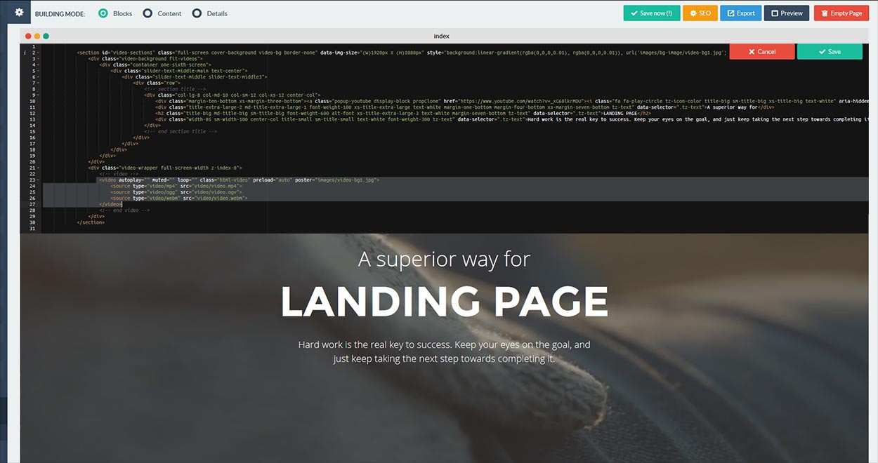
HTML5 Video
To change section's background video, open the source code of the section and input the video url in the src attribute of the source tag, also input an alternative (poster) image that show in mobile devices instead of the video in the poster attribute in the video tag.
Cloning Items
Items which have been setup in the "editableItems" array in /js/builder.js can be cloned. Switch to "Details" building mode, select the item which you want to clone and finally click the clone button from the left panel. Please note that cloned items will be inserted into the canvas right next to the original item.
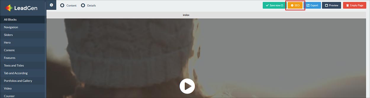
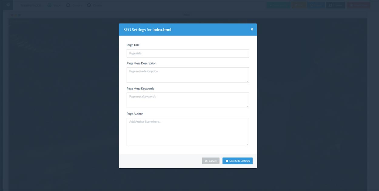
SEO Setting
Search engine optimization (SEO) is the process of affecting the visibility of a website or a web page in a search engine’s “natural” or un-paid (“organic”) search results.
Simply click on SEO button at top, you can set Page Title, Page Meta Description, Page Meta Keywords and Page Author for current open page, you can apply same thing for other pages one by one.
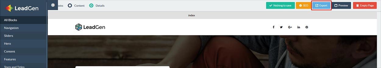
Export HTML
Whenever the user is happy with the final result, the created markup can be exported by click the blue export button. The export feature will grab all the used HTML elements for each created page. Once all pages are completed, all the HTML files are bundled into a ZIP archive together with the other external resources like stylesheets, fonts, Javascript files and images which will be downloaded by the end user. Now you can simply extract ZIP file and upload it to your hosting server.
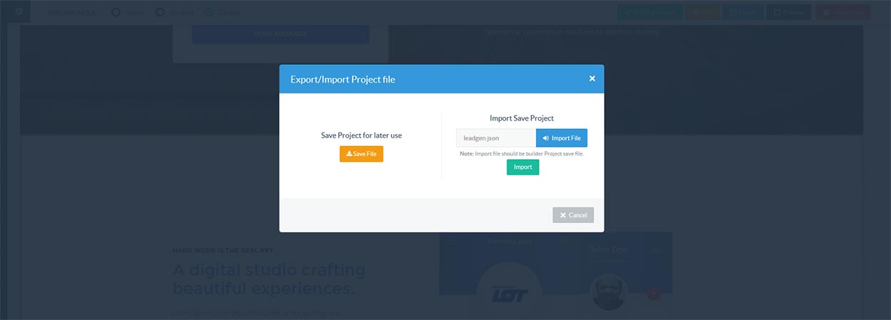
Export/Import Project
You can save any time a copy of your landing page project that you are working on as ".json" files which you can import it later to the builder and continue editing. Simply go to left sidebar and click on the button "Export & Import" in the bottom of the sidebar.
Note After the import process current landing pages will be removed, so save your current work by exporting it from the save file button. Exported ".zip" file can not be imported. You can only import file to LeadGen builder which are exported as .JSON file from "Export/Import" option from left sidebar.
Preview HTML
To preview a page, click on the preview button in the top bar, you can only preview a single page; links to other pages won't work. When you make changes to your page, reloading the preview won't work, instead you'll have to use the "Preview" button again.
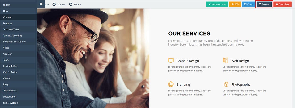

Note Sticky header will not work in Preview but that will work fine in your final exported package.
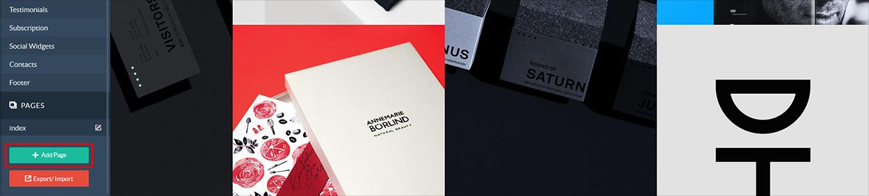
Pages
The HTML Builder script allows users to create multiple pages at once. To add a new page, simply click the green button labeled "+ Add Page" just below the current pages list. You can alter the page names as well (please use names without the .html extension, these are added automatically during the export). When exporting the markup, the pages will use the same names. To delete a page, simply click the little delete icon next to the page you'd like to delete.
Navigation and Header
We have many types of headers and navigation as per the demo layout. The list of various header types & its descriptions are provided below for your reference:
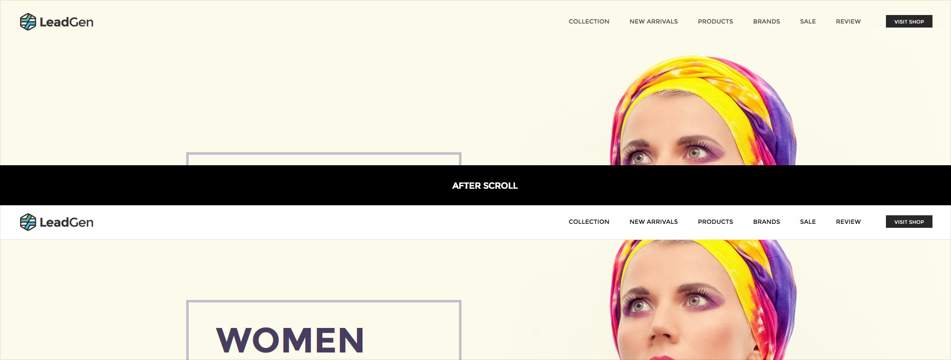
Sticky Header
In addition to a choice of header layouts, LeadGen also has a sticky header option. For improved usability, as the user scrolls down a page, the sticky header activates ensuring the website’s main menu is always accessible. Simply add any navigation block to page and switch to "Block Mode" and click on source button for navigation block and add CSS class as per below information, there are different CSS class for different navigation header to activate Sticky Header, if it is already sticky then no needs to add this class.
Note Sticky header will not work in Preview but that will work fine in your final exported package.
<nav class="navbar bg-white tz-header-bg no-margin alt-font light-header">
    <div class="container">
        <div class="row">
            ...
        </div>
    </div>
</nav>
Note If you want to make sticky header then you can add shrink-header class in nav tag. Please refer below HTML code for example.
<nav class="navbar bg-white tz-header-bg no-margin alt-font light-header shrink-header">
    <div class="container">
        <div class="row">
            ...
        </div>
    </div>
</nav>
Example You can find this navigation type in Application demo.
Sticky Transparent Header with Dark Background
<nav class="navbar bg-black tz-header-bg no-margin alt-font dark-header">
    <div class="container">
        <div class="row">
            ...
        </div>
    </div>
</nav>
Note If you want to make sticky transparent header with dark background then you can add shrink-transparent-header-dark, header-border-light classes in nav tag and remove bg-black class in nav tag. Please refer below HTML code for example.
<nav class="navbar tz-header-bg no-margin alt-font shrink-transparent-header-dark header-border-light dark-header">
    <div class="container">
        <div class="row">
            ...
        </div>
    </div>
</nav>
Example You can find this navigation type in Agency demo.Note If you use our pre-defined demo then you can remove
bg-black or bg-white class in nav tag after export.
Sticky Transparent Header with Light Background
<nav class="navbar bg-white white-header tz-header-bg no-margin alt-font light-header">
    <div class="container">
        <div class="row">
            ...
        </div>
    </div>
</nav>
Note If you want to make sticky transparent header with light background then you can add shrink-transparent-header-light, header-border-dark classes in nav tag and remove bg-white class in nav tag. Please refer below HTML code for example.
<nav class="navbar tz-header-bg alt-font no-margin shrink-transparent-header-light header-border-dark light-header">
    <div class="container">
        <div class="row">
            ...
        </div>
    </div>
</nav>
Example You can find this navigation type in Shop demo.Note If you use our pre-defined demo then you can remove
bg-black or bg-white class in nav tag after export.
Sticky Header with Top bar

<nav class="navbar bg-white white-header alt-font no-margin no-padding light-header">
    <div class="header-top bg-light-gray tz-header-bg">
        <div class="container">
            ...
        </div>
    </div>
</nav>
Note If you want to make sticky header with top bar then you can add shrink-medium-header class in nav tag. Please refer below HTML code for example.
<nav class="navbar bg-white white-header alt-font no-margin no-padding shrink-medium-header light-header">
    <div class="header-top bg-light-gray tz-header-bg">
        <div class="container">
            ...
        </div>
    </div>
</nav>
Example You can find this navigation type in Business demo.Header with Center Logo
<nav class="navbar bg-white tz-header-bg no-margin alt-font light-header">
    <div class="container navigation-menu">
        <div class="row display-block">
            ...
        </div>
    </div>
</nav>
Note If you want to make sticky header with center logo then you can add shrink-big-header class in nav tag. Please refer below HTML code for example.
<nav class="navbar bg-white tz-header-bg no-margin alt-font light-header shrink-big-header">
    <div class="container navigation-menu">
        <div class="row display-block">
            ...
        </div>
    </div>
</nav>
Example You can find this navigation type in Wedding demo.Simple Dropdown Menu
If you want to add submenu navigation to your any top level menu item in the header then in the header navigation code, you can use below type of reference code for your top level menu item LI.
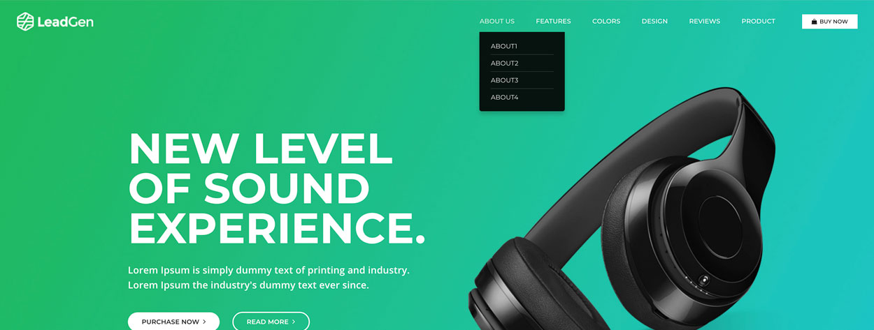
<li class="propClone dropdown">
	<a href="#" class="dropdown-toggle" data-toggle="dropdown">ABOUT US</a>
	<ul class="dropdown-menu">
		<li><a href="#">ABOUT1</a></li>
		<li><a href="#">ABOUT2</a></li>
		<li><a href="#">ABOUT3</a></li>
		<li><a href="#">ABOUT4</a></li>
	</ul>
</li>
Columns & Grid
Basic grid layouts to get you familiar with building within the Bootstrap grid system.
Three equal columns
Get three equal-width columns starting at desktops and scaling to large desktops. On mobile devices, tablets and below, the columns will automatically stack.
.col-md-4.col-md-4.col-md-4Three unequal columns
Get three columns starting at desktops and scaling to large desktops of various widths. Remember, grid columns should add up to twelve for a single horizontal block. More than that, and columns start stacking no matter the viewport.
.col-md-3.col-md-6.col-md-3Two columns
Get two columns starting at desktops and scaling to large desktops.
.col-md-8.col-md-4Full width, single column
.col-md-12Two columns with two nested columns
Per the documentation, nesting is easy—just put a row of columns within an existing column. This gives you two columns starting at desktops and scaling to large desktops, with another two (equal widths) within the larger column.
At mobile device sizes, tablets and down, these columns and their nested columns will stack.
.col-md-8
.col-md-6.col-md-6.col-md-4Mixed: mobile and desktop
The Bootstrap 3 grid system has four tiers of classes: xs (phones), sm (tablets), md (desktops), and lg (larger desktops). You can use nearly any combination of these classes to create more dynamic and flexible layouts.
Each tier of classes scales up, meaning if you plan on setting the same widths for xs and sm, you only need to specify xs.
.col-xs-12 .col-md-8.col-xs-6 .col-md-4.col-xs-6 .col-md-4.col-xs-6 .col-md-4.col-xs-6 .col-md-4.col-xs-6.col-xs-6Mixed: mobile, tablet, and desktop
.col-xs-12 .col-sm-6 .col-lg-8.col-xs-6 .col-lg-4.col-xs-6 .col-sm-4.col-xs-6 .col-sm-4.col-xs-6 .col-sm-4Column clearing
Clear floats at specific breakpoints to prevent awkward wrapping with uneven content.
.col-xs-6 .col-sm-3
.col-xs-6 .col-sm-3.col-xs-6 .col-sm-3.col-xs-6 .col-sm-3Offset, push, and pull resets
Reset offsets, pushes, and pulls at specific breakpoints.
.col-sm-5 .col-md-6.col-sm-5 .col-sm-offset-2 .col-md-6 .col-md-offset-0.col-sm-6 .col-md-5 .col-lg-6.col-sm-6 .col-md-5 .col-md-offset-2 .col-lg-6 .col-lg-offset-0Grid Structure
.col-md-1.col-md-1.col-md-1.col-md-1.col-md-1.col-md-1.col-md-1.col-md-1.col-md-1.col-md-1.col-md-1.col-md-1.col-md-2.col-md-2.col-md-2.col-md-2.col-md-2.col-md-2.col-md-3.col-md-3.col-md-3.col-md-3.col-md-4.col-md-4.col-md-4.col-md-5.col-md-5.col-md-5.col-md-6.col-md-6.col-md-1.col-md-11.col-md-2.col-md-10.col-md-3.col-md-9.col-md-4.col-md-8.col-md-5.col-md-7Add Google and Custom Fonts
If you want to add Google Font then please follow below information:
- Go to Google Fonts for Google Fonts.
- Select font which one you want to add and Click right side corner on "+" icon, see below image for more inforamtion.
- After addition of fonts you can see "Family Selected" box, simply open that box and Click on "@IMPORT" tab.
- Copy import url and go to "Builder/elements/css" folder, Open "base.css" and paste import url after line(30).
- Suppose if you want to use "'Roboto', sans-serif" instead of "'Open Sans', sans-serif" then find "'Open Sans', sans-serif" in base.css and replace it to "'Roboto', sans-serif".
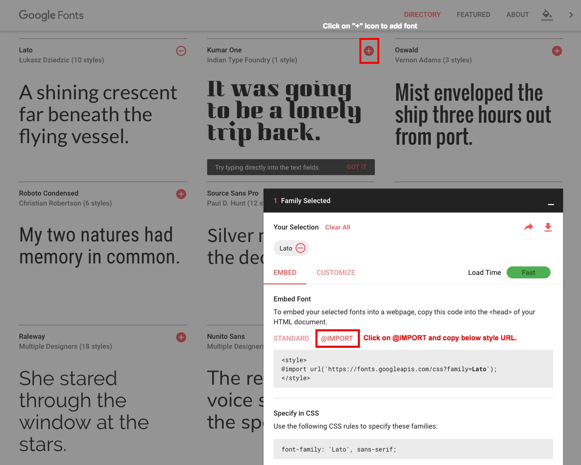
Note Custom Font: If you want to use custom font then go to "Builder/elements/css" folder, Open "base.css" and simply find font family name and replace it with your custom font family name.
Font Awesome Icon
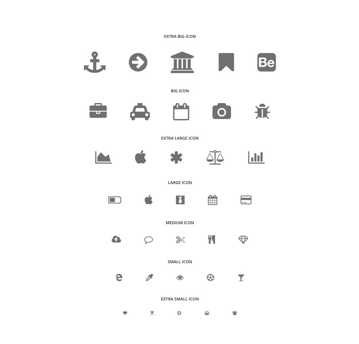
We use excellent Fontawesome service. Font Awesome gives you scalable vector icons that can instantly be customized — size, color, drop shadow, and anything that can be done with the power of CSS. Over 500 new icons.
Icon Size
<!-- Extra Big Icon -->
<i class="fa fa-anchor icon-extra-big"></i>
<!-- End Extra Big Icon -->

<!-- Icon Big -->
<i class="fa fa-reply icon-big"></i>
<!-- End Icon Big -->

<!-- Extra Large Icon -->
<i class="fa fa-mail-reply-all icon-extra-large"></i>
<!-- End Extra Large Icon -->

<!-- Large Icon -->
<i class="fa fa-navicon icon-large"></i>
<!-- End Large Icon -->

<!-- Medium Icon -->
<i class="fa fa-check icon-medium"></i>
<!-- End Medium Icon -->

<!-- Small Icon -->
<i class="fa fa-copy icon-small"></i>
<!-- End Small Icon -->

<!-- Extra Small Icon -->
<i class="fa fa-reply icon-extra-small"></i>
<!-- End Extra Small Icon -->
Icon Class
NoteFont Awesome gives you scalable vector icons that can instantly be customized — size, color, drop shadow, and anything that can be done with the power of CSS.
Check the cheatsheet.
Themify Icon
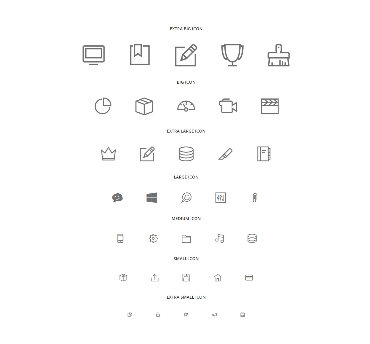
Themify Icons is a complete set of icons for use in web design and apps, consisting of 320+ pixel-perfect, hand-crafted icons that draw inspiration from Apple iOS 7 - available to the public, 100% FREE! You may use or distribute it for any purpose, whether personal or commercial. This icon set is a must have tool for web designers and developers.
Icon Size
<!-- Extra Big Icon -->
<i class="fa ti-desktop icon-extra-big"></i>
<!-- End Extra Big Icon -->

<!-- Icon Big -->
<i class="fa ti-pie-chart icon-big"></i>
<!-- End Icon Big -->

<!-- Extra Large Icon -->
<i class="fa ti-crown icon-extra-large"></i>
<!-- End Extra Large Icon -->

<!-- Large Icon -->
<i class="fa ti-bookmark-alt icon-large"></i>
<!-- End Large Icon -->

<!-- Medium Icon -->
<i class="fa ti-dashboard  icon-medium"></i>
<!-- End Medium Icon -->

<!-- Small Icon -->
<i class="fa ti-microsoft-alt icon-small"></i>
<!-- End Small Icon -->

<!-- Extra Small Icon -->
<i class="fa ti-folder icon-extra-small"></i>
<!-- End Extra Small Icon -->
Icon Class
NoteThemify Icons gives you scalable vector icons that can instantly be customized — size, color, drop shadow, and anything that can be done with the power of CSS.
Check the cheatsheet.
Twitter Feed
The Twitter feed element uses a HTML5 data attribute called "data-widget-id" to determine which feed to display. Changing it requires you to create a widget from your Twitter account.
If you want to create new Widget follow below steps:
- Go to the "Settings" page of your Twitter account and clicking "Widgets"
- Click "Create New" and select "Search" in dropdown
- In Configuration page, Enter value of "Search Query" and Set all Configuration then click on "Create Widget"
- Go back to the "Widgets" page and click "Edit" on your newly created widget
- From here you need to copy the "data-widget-id" in Box. The "data-widget-id" is the long numerical string and paste it into the "data-widget-id" attribute on the tweets div.
Twitter element Markup
Once you've got your widget ID, paste it into the data-widget-id element of the tweets div. Leave the tweets div empty, it will be populated by the Twitterfetcher plugin when the page loads.
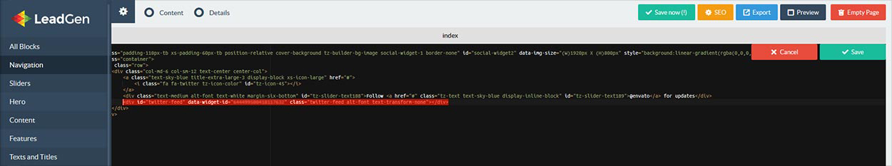
<div id="twitter-feed" data-widget-id="11111111111111111" class="twitter-feed alt-font text-transform-none"></div>
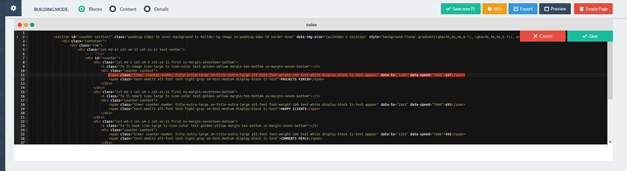
Counter
Counter is a jQuery plugin that animates a number from zero (counting up towards it).
Simply add counter block to page and switch to "Block Mode" and click on source button for counter block then change attributes like as "data-to" and "data-speed" as per your requirement, also fill that tag value same as which is put it in "data-to" attribute value and save it.
<div class="row">
<div class="col-md-12 col-sm-12 col-xs-12 text-center">
    <!-- timer -->
    <div id="counter">
        <div class="col-md-3 col-sm-6 col-xs-12 sm-margin-fifteen-bottom xs-margin-seventeen-bottom">
            <div class="counter-content">
                <span class="timer counter-number title-extra-large sm-title-extra-large-1 alt-font text-dark-gray margin-three-bottom xs-margin-one-half-bottom display-block tz-text appear" data-to="1500" data-speed="7000">1500</span>
                <span class="text-medium sm-text-medium display-block tz-text">Projects Completed</span>
                <div class="separator-line3 bg-pink center-col builder-bg margin-fifteen-top sm-margin-ten-top"></div>
            </div>
        </div>
        <div class="col-md-3 col-sm-6 col-xs-12 sm-margin-fifteen-bottom xs-margin-seventeen-bottom">
            <div class="counter-content">
                <span class="timer counter-number title-extra-large sm-title-extra-large-1 alt-font text-dark-gray margin-three-bottom xs-margin-one-half-bottom display-block tz-text appear" data-to="1400" data-speed="7000">1400</span>
                <span class="text-medium sm-text-medium display-block tz-text">Happy Clients</span>
                <div class="separator-line3 bg-pink center-col builder-bg margin-fifteen-top sm-margin-ten-top"></div>
            </div>
        </div>
        <div class="col-md-3 col-sm-6 col-xs-12 xs-margin-seventeen-bottom">
            <div class="counter-content">
                <span class="timer counter-number title-extra-large sm-title-extra-large-1 alt-font text-dark-gray margin-three-bottom xs-margin-one-half-bottom display-block tz-text appear" data-to="1250" data-speed="7000">1250</span>
                <span class="text-medium sm-text-medium display-block tz-text">Cups of Coffee</span>
                <div class="separator-line3 bg-pink center-col builder-bg margin-fifteen-top sm-margin-ten-top"></div>
            </div>
        </div>
        <div class="col-md-3 col-sm-6 col-xs-12 xs-no-margin-bottom">
            <div class="counter-content">
                <span class="timer counter-number title-extra-large sm-title-extra-large-1 alt-font text-dark-gray margin-three-bottom xs-margin-one-half-bottom display-block tz-text appear" data-to="1600" data-speed="7000">1600</span>
                <span class="text-medium sm-text-medium display-block tz-text">Hours Worked</span>
                <div class="separator-line3 bg-pink center-col builder-bg margin-fifteen-top sm-margin-ten-top"></div>
            </div>
        </div>
    </div>
    <!-- end timer -->
</div>
</div>
Animation
Scroll to reveal animations are latest in the trends. You can do them too with LeadGen. You can use animations on any element you want. Here is the Sample Code:
<div class="wow bounceInUp">
  Content to Reveal Here
</div>
You can also use delays, duration and offset for your animations:
<section class="wow slideInLeft" data-wow-duration="1200ms" data-wow-delay="500ms">
    ...
</section>
NoteDelay duration is in milliseconds.
Here is the list of the Animation Types you can use:
bounceflashpulserubberBandshakeswingtadawobblebounceInbounceInDownbounceInLeftbounceInRightbounceInUpbounceOutbounceOutDownbounceOutLeftbounceOutRightbounceOutUpfadeInfadeInDownfadeInDownBigfadeInLeftfadeInLeftBigfadeInRightfadeInRightBigfadeInUpfadeInUpBigfadeOutfadeOutDownfadeOutDownBigfadeOutLeftfadeOutLeftBigfadeOutRightfadeOutRightBigfadeOutUpfadeOutUpBigflipflipInXflipInYflipOutXflipOutYlightSpeedInlightSpeedOutrotateInrotateInDownLeftrotateInDownRightrotateInUpLeftrotateInUpRightrotateOutrotateOutDownLeftrotateOutDownRightrotateOutUpLeftrotateOutUpRighthingerollInrollOutzoomInzoomInDownzoomInLeftzoomInRightzoomInUpzoomOutzoomOutDownzoomOutLeftzoomOutRightzoomOutUp
Portfolio
LeadGen provides a very elegant way to showcase your work. Setting up Portfolio is simple. Please use the following codes:
Setting up Portfolio Filter:
Simply add Portfolio Filter block to page and switch to "Block Mode" and click on source button for Portfolio block.
Suppose you want to change filter option then please follow below steps:
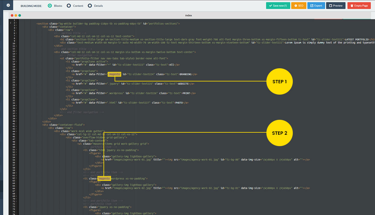
Step 1: Suppose you are going to change “.magento” to “.graphics” then please change it in portfolio filter href with "data-filter" attribute. So it will be looks like below.
<a href="#" data-filter=". graphics" id="tz-slider-text224" class="tz-text">GRAPHICS</a>
Step 2: Please add same “graphics” as class in portfolio item
<!--  portfolio item -->
<li class="graphics xs-no-padding">
<!-- filter navigation -->
<ul class="portfolio-filter nav nav-tabs tab-style3 border-none alt-font">
    <li class="propClone active">
        <a href="#" data-filter="*" id="tz-slider-text223" class="tz-text">All</a>
    </li>
    <li class="propClone">
        <a href="#" data-filter=".magento" id="tz-slider-text224" class="tz-text">BRANDING</a>
    </li>
    <li class="propClone">
        <a href="#" data-filter=".jquery" id="tz-slider-text225" class="tz-text">WEBSITE</a>
    </li>
    <li class="propClone">
        <a href="#" data-filter=".wordpress" id="tz-slider-text226" class="tz-text">PRINT</a>
    </li>
    <li class="propClone">
        <a href="#" data-filter=".html" id="tz-slider-text227" class="tz-text">PHOTO</a>
    </li>
</ul>
<!-- end filter navigation -->
Setting up Portfolio Columns and Items:
You can change portfolio columns by changing class of portfolio main DIV to work-2col, work-3col, work-4col and work-5col as per the columns you need. You can add data filter class name in portfolio LI item as per the filter category above. Below is the portfolio section code for your reference:
<div class="row">
    <div class="work-4col wide gutter">
        <div class="col-lg-12 col-md-12 col-sm-12 col-xs-12">
            <div class="overflow-hidden grid-gallery">
                <div class="tab-content">
                    <ul class="masonry-items grid work-gallery grid">
                        <!-- portfolio item -->
                        <li class="html jquery xs-no-padding">
                            <figure>
                                <div class="gallery-img lightbox-gallery">
                                    <a href="images/agency-work-01.jpg" title=""><img src="images/agency-work-01.jpg" id="tz-bg-80" data-img-size="(W)800px X (H)650px" alt=""></a>
                                </div>
                            </figure>
                        </li>
                        <!-- end portfolio item -->
                        <!-- portfolio item -->
                        <li class="magento wordpress xs-no-padding">
                            <figure>
                                <div class="gallery-img lightbox-gallery">
                                    <a href="images/agency-work-02.jpg" title=""><img src="images/agency-work-02.jpg" id="tz-bg-81" data-img-size="(W)800px X (H)650px" alt=""></a>
                                </div>
                            </figure>
                        </li>
                        <!-- end portfolio item -->
                        <!-- portfolio item -->
                        <li class="jquery xs-no-padding">
                            <figure>
                                <div class="gallery-img lightbox-gallery">
                                    <a href="images/agency-work-03.jpg" title=""><img src="images/agency-work-03.jpg" id="tz-bg-82" data-img-size="(W)800px X (H)650px" alt=""></a>
                                </div>
                            </figure>
                        </li>
                        <!-- end portfolio item -->
                        <!-- portfolio item -->
                        <li class="html magento jquery xs-no-padding">
                            <figure>
                                <div class="gallery-img lightbox-gallery">
                                    <a href="images/agency-work-04.jpg" title=""><img src="images/agency-work-04.jpg" id="tz-bg-83" data-img-size="(W)800px X (H)650px" alt=""></a>
                                </div>
                            </figure>
                        </li>
                        <!-- end portfolio item -->
                        <!-- portfolio item -->
                        <li class="html wordpress magento xs-no-padding">
                            <figure>
                                <div class="gallery-img lightbox-gallery">
                                    <a href="images/agency-work-05.jpg" title=""><img src="images/agency-work-05.jpg" id="tz-bg-84" data-img-size="(W)800px X (H)650px" alt=""></a>
                                </div>
                            </figure>
                        </li>
                        <!-- end portfolio item -->
                        <!-- portfolio item -->
                        <li class="wordpress html xs-no-padding">
                            <figure>
                                <div class="gallery-img lightbox-gallery">
                                    <a href="images/agency-work-06.jpg" title=""><img src="images/agency-work-06.jpg" id="tz-bg-85" data-img-size="(W)800px X (H)650px" alt=""></a>
                                </div>
                            </figure>
                        </li>
                        <!-- end portfolio item -->
                        <!-- portfolio item -->
                        <li class="magento xs-no-padding">
                            <figure>
                                <div class="gallery-img lightbox-gallery">
                                    <a href="images/agency-work-07.jpg" title=""><img src="images/agency-work-07.jpg" id="tz-bg-86" data-img-size="(W)800px X (H)650px" alt=""></a>
                                </div>
                            </figure>
                        </li>
                        <!-- end portfolio item -->
                        <!-- portfolio item -->
                        <li class="wordpress jquery xs-no-padding">
                            <figure>
                                <div class="gallery-img lightbox-gallery">
                                    <a href="images/agency-work-08.jpg" title=""><img src="images/agency-work-08.jpg" id="tz-bg-87" data-img-size="(W)800px X (H)650px" alt=""></a>
                                </div>
                            </figure>
                        </li>
                        <!-- end portfolio item -->
                    </ul>
                </div>
            </div>
        </div>
    </div>
</div>
Portfolio Layout
LeadGen includes different types of portfolio layout as mentioned below to setup your own portfolio as per your requirement:
Portfolio Grid

<div class="container-fluid">
    <div class="row">
        <div class="work-4col wide">
            <div class="col-lg-12 col-md-12 col-sm-12 col-xs-12 no-padding">
                <div class="overflow-hidden grid-gallery">
                    <div class="tab-content">
                        <ul class="masonry-items grid work-gallery grid">
                            <!-- portfolio item -->
                            <li class="xs-no-padding">
                                <figure>
                                    <div class="gallery-img lightbox-gallery">
                                        <a href="images/agency-work-01.jpg" title=""><img src="images/agency-work-01.jpg" id="tz-bg-102" data-img-size="(W)800px X (H)650px" alt=""></a>
                                    </div>
                                </figure>
                            </li>
                            <!-- end portfolio item -->
                            <!-- portfolio item -->
                            <li class="xs-no-padding">
                                <figure>
                                    <div class="gallery-img lightbox-gallery">
                                        <a href="images/agency-work-04.jpg" title=""><img src="images/agency-work-04.jpg" id="tz-bg-103" data-img-size="(W)800px X (H)650px" alt=""></a>
                                    </div>
                                </figure>
                            </li>
                            <!-- end portfolio item -->
                            <!-- portfolio item -->
                            <li class="xs-no-padding">
                                <figure>
                                    <div class="gallery-img lightbox-gallery">
                                        <a href="images/agency-work-03.jpg" title=""><img src="images/agency-work-03.jpg" id="tz-bg-104" data-img-size="(W)800px X (H)650px" alt=""></a>
                                    </div>
                                </figure>
                            </li>
                            <!-- end portfolio item -->
                            <!-- portfolio item -->
                            <li class="xs-no-padding">
                                <figure>
                                    <div class="gallery-img lightbox-gallery">
                                        <a href="images/agency-work-02.jpg" title=""><img src="images/agency-work-02.jpg" id="tz-bg-105" data-img-size="(W)800px X (H)650px" alt=""></a>
                                    </div>
                                </figure>
                            </li>
                            <!-- end portfolio item -->
                            <!-- portfolio item -->
                            <li class="xs-no-padding">
                                <figure>
                                    <div class="gallery-img lightbox-gallery">
                                        <a href="images/agency-work-05.jpg" title=""><img src="images/agency-work-05.jpg" id="tz-bg-106" data-img-size="(W)800px X (H)650px" alt=""></a>
                                    </div>
                                </figure>
                            </li>
                            <!-- end portfolio item -->
                            <!-- portfolio item -->
                            <li class="xs-no-padding">
                                <figure>
                                    <div class="gallery-img lightbox-gallery">
                                        <a href="images/agency-work-06.jpg" title=""><img src="images/agency-work-06.jpg" id="tz-bg-107" data-img-size="(W)800px X (H)650px" alt=""></a>
                                    </div>
                                </figure>
                            </li>
                            <!-- end portfolio item -->
                            <!-- portfolio item -->
                            <li class="xs-no-padding">
                                <figure>
                                    <div class="gallery-img lightbox-gallery">
                                        <a href="images/agency-work-07.jpg" title=""><img src="images/agency-work-07.jpg" id="tz-bg-108" data-img-size="(W)800px X (H)650px" alt=""></a>
                                    </div>
                                </figure>
                            </li>
                            <!-- end portfolio item -->
                            <!-- portfolio item -->
                            <li class="xs-no-padding">
                                <figure>
                                    <div class="gallery-img lightbox-gallery">
                                        <a href="images/agency-work-08.jpg" title=""><img src="images/agency-work-08.jpg" id="tz-bg-109" data-img-size="(W)800px X (H)650px" alt=""></a>
                                    </div>
                                </figure>
                            </li>
                            <!-- end portfolio item -->
                        </ul>
                    </div>
                </div>
            </div>
        </div>
    </div>
</div>
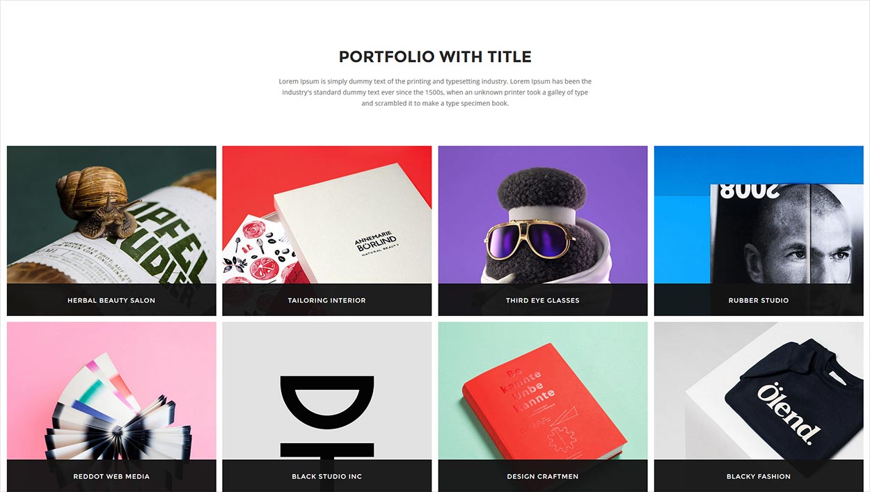
Portfolio Grid with Title
<div class="container-fluid">
    <div class="row">
        <div class="work-4col wide work-with-title gutter">
            <div class="col-lg-12 col-md-12 col-sm-12 col-xs-12">
                <div class="overflow-hidden grid-gallery">
                    <div class="tab-content">
                        <ul class="masonry-items grid work-gallery grid">
                            <!-- portfolio item -->
                            <li class="html jquery xs-no-padding">
                                <figure>
                                    <div class="gallery-img lightbox-gallery">
                                        <a href="images/agency-work-10.jpg" title=""><img src="images/agency-work-10.jpg" id="tz-bg-88" data-img-size="(W)800px X (H)650px" alt=""></a>
                                    </div>
                                    <figcaption>
                                        <h3 class="text-medium alt-font letter-spacing-1 tz-text text-white">HERBAL BEAUTY SALON</h3>
                                        <div class="text-small2 letter-spacing-1 text-gray tz-text"> <p>LOGO & BRANDING</p> </div>
                                    </figcaption>
                                </figure>
                            </li>
                            <!-- end portfolio item -->
                            <!-- portfolio item -->
                            <li class="magento wordpress xs-no-padding">
                                <figure>
                                    <div class="gallery-img lightbox-gallery">
                                        <a href="images/agency-work-02.jpg" title=""><img src="images/agency-work-02.jpg" id="tz-bg-89" data-img-size="(W)800px X (H)650px" alt=""></a>
                                    </div>
                                    <figcaption>
                                        <h3 class="text-medium alt-font letter-spacing-1 tz-text text-white">TAILORING INTERIOR</h3>
                                        <div class="text-small2 letter-spacing-1 text-gray tz-text"> <p> WEB & BRANDING</p> </div>
                                    </figcaption>
                                </figure>
                            </li>
                            <!-- end portfolio item -->
                            <!-- portfolio item -->
                            <li class="jquery xs-no-padding">
                                <figure>
                                    <div class="gallery-img lightbox-gallery">
                                        <a href="images/agency-work-11.jpg" title=""><img src="images/agency-work-11.jpg" id="tz-bg-90" data-img-size="(W)800px X (H)650px" alt=""></a>
                                    </div>
                                    <figcaption>
                                        <h3 class="text-medium alt-font letter-spacing-1 tz-text text-white">THIRD EYE GLASSES</h3>
                                        <div class="text-small2 letter-spacing-1 text-gray tz-text"> <p> LOGO & BROCHURE</p> </div>
                                    </figcaption>
                                </figure>
                            </li>
                            <!-- end portfolio item -->
                            <!-- portfolio item -->
                            <li class="html magento jquery xs-no-padding">
                                <figure>
                                    <div class="gallery-img lightbox-gallery">
                                        <a href="images/agency-work-04.jpg" title=""><img src="images/agency-work-04.jpg" id="tz-bg-91" data-img-size="(W)800px X (H)650px" alt=""></a>
                                    </div>
                                    <figcaption>
                                        <h3 class="text-medium alt-font letter-spacing-1 tz-text text-white">RUBBER STUDIO</h3>
                                        <div class="text-small2 letter-spacing-1 text-gray tz-text"> <p> BRANDING & IDENTITY</p> </div>
                                    </figcaption>
                                </figure>
                            </li>
                            <!-- end portfolio item -->
                            <!-- portfolio item -->
                            <li class="html wordpress magento xs-no-padding">
                                <figure>
                                    <div class="gallery-img lightbox-gallery">
                                        <a href="images/agency-work-05.jpg" title=""><img src="images/agency-work-05.jpg" id="tz-bg-92" data-img-size="(W)800px X (H)650px" alt=""></a>
                                    </div>
                                    <figcaption>
                                        <h3 class="text-medium alt-font letter-spacing-1 tz-text text-white">REDDOT WEB MEDIA</h3>
                                        <div class="text-small2 letter-spacing-1 text-gray tz-text"> <p> LOGO & BROCHURE</p> </div>
                                    </figcaption>
                                </figure>
                            </li>
                            <!-- end portfolio item -->
                            <!-- portfolio item -->
                            <li class="wordpress html xs-no-padding">
                                <figure>
                                    <div class="gallery-img lightbox-gallery">
                                        <a href="images/agency-work-06.jpg" title=""><img src="images/agency-work-06.jpg" id="tz-bg-93" data-img-size="(W)800px X (H)650px" alt=""></a>
                                    </div>
                                    <figcaption>
                                        <h3 class="text-medium alt-font letter-spacing-1 tz-text text-white">BLACK STUDIO INC</h3>
                                        <div class="text-small2 letter-spacing-1 text-gray tz-text"> <p> BRANDING & IDENTITY</p> </div>
                                    </figcaption>
                                </figure>
                            </li>
                            <!-- end portfolio item -->
                            <!-- portfolio item -->
                            <li class="magento xs-no-padding">
                                <figure>
                                    <div class="gallery-img lightbox-gallery">
                                        <a href="images/agency-work-07.jpg" title=""><img src="images/agency-work-07.jpg" id="tz-bg-94" data-img-size="(W)800px X (H)650px" alt=""></a>
                                    </div>
                                    <figcaption>
                                        <h3 class="text-medium alt-font letter-spacing-1 tz-text text-white">DESIGN CRAFTMEN</h3>
                                        <div class="text-small2 letter-spacing-1 text-gray tz-text"> <p> WEB & BRANDING</p> </div>
                                    </figcaption>
                                </figure>
                            </li>
                            <!-- end portfolio item -->
                            <!-- portfolio item -->
                            <li class="wordpress jquery xs-no-padding">
                                <figure>
                                    <div class="gallery-img lightbox-gallery">
                                        <a href="images/agency-work-08.jpg" title=""><img src="images/agency-work-08.jpg" id="tz-bg-95" data-img-size="(W)800px X (H)650px" alt=""></a>
                                    </div>
                                    <figcaption>
                                        <h3 class="text-medium alt-font letter-spacing-1 tz-text text-white">BLACKY FASHION</h3>
                                        <div class="text-small2 letter-spacing-1 text-gray tz-text"> <p> LOGO & BRANDING </p> </div>
                                    </figcaption>
                                </figure>
                            </li>
                            <!-- end portfolio item -->
                        </ul>
                    </div>
                </div>
            </div>
        </div>
    </div>
</div>
Portfolio Grid with Gutter

<div class="container-fluid">
    <div class="row">
        <div class="work-4col wide gutter">
            <div class="col-lg-12 col-md-12 col-sm-12 col-xs-12">
                <div class="overflow-hidden grid-gallery">
                    <div class="tab-content">
                        <ul class="masonry-items grid work-gallery grid">
                            <!-- portfolio item -->
                            <li class="html jquery xs-no-padding">
                                <figure>
                                    <div class="gallery-img lightbox-gallery">
                                        <a href="images/agency-work-01.jpg" title=""><img src="images/agency-work-01.jpg" id="tz-bg-80" data-img-size="(W)800px X (H)650px" alt=""></a>
                                    </div>
                                </figure>
                            </li>
                            <!-- end portfolio item -->
                            <!-- portfolio item -->
                            <li class="magento wordpress xs-no-padding">
                                <figure>
                                    <div class="gallery-img lightbox-gallery">
                                        <a href="images/agency-work-02.jpg" title=""><img src="images/agency-work-02.jpg" id="tz-bg-81" data-img-size="(W)800px X (H)650px" alt=""></a>
                                    </div>
                                </figure>
                            </li>
                            <!-- end portfolio item -->
                            <!-- portfolio item -->
                            <li class="jquery xs-no-padding">
                                <figure>
                                    <div class="gallery-img lightbox-gallery">
                                        <a href="images/agency-work-03.jpg" title=""><img src="images/agency-work-03.jpg" id="tz-bg-82" data-img-size="(W)800px X (H)650px" alt=""></a>
                                    </div>
                                </figure>
                            </li>
                            <!-- end portfolio item -->
                            <!-- portfolio item -->
                            <li class="html magento jquery xs-no-padding">
                                <figure>
                                    <div class="gallery-img lightbox-gallery">
                                        <a href="images/agency-work-04.jpg" title=""><img src="images/agency-work-04.jpg" id="tz-bg-83" data-img-size="(W)800px X (H)650px" alt=""></a>
                                    </div>
                                </figure>
                            </li>
                            <!-- end portfolio item -->
                            <!-- portfolio item -->
                            <li class="html wordpress magento xs-no-padding">
                                <figure>
                                    <div class="gallery-img lightbox-gallery">
                                        <a href="images/agency-work-05.jpg" title=""><img src="images/agency-work-05.jpg" id="tz-bg-84" data-img-size="(W)800px X (H)650px" alt=""></a>
                                    </div>
                                </figure>
                            </li>
                            <!-- end portfolio item -->
                            <!-- portfolio item -->
                            <li class="wordpress html xs-no-padding">
                                <figure>
                                    <div class="gallery-img lightbox-gallery">
                                        <a href="images/agency-work-06.jpg" title=""><img src="images/agency-work-06.jpg" id="tz-bg-85" data-img-size="(W)800px X (H)650px" alt=""></a>
                                    </div>
                                </figure>
                            </li>
                            <!-- end portfolio item -->
                            <!-- portfolio item -->
                            <li class="magento xs-no-padding">
                                <figure>
                                    <div class="gallery-img lightbox-gallery">
                                        <a href="images/agency-work-07.jpg" title=""><img src="images/agency-work-07.jpg" id="tz-bg-86" data-img-size="(W)800px X (H)650px" alt=""></a>
                                    </div>
                                </figure>
                            </li>
                            <!-- end portfolio item -->
                            <!-- portfolio item -->
                            <li class="wordpress jquery xs-no-padding">
                                <figure>
                                    <div class="gallery-img lightbox-gallery">
                                        <a href="images/agency-work-08.jpg" title=""><img src="images/agency-work-08.jpg" id="tz-bg-87" data-img-size="(W)800px X (H)650px" alt=""></a>
                                    </div>
                                </figure>
                            </li>
                            <!-- end portfolio item -->
                        </ul>
                    </div>
                </div>
            </div>
        </div>
    </div>
</div>
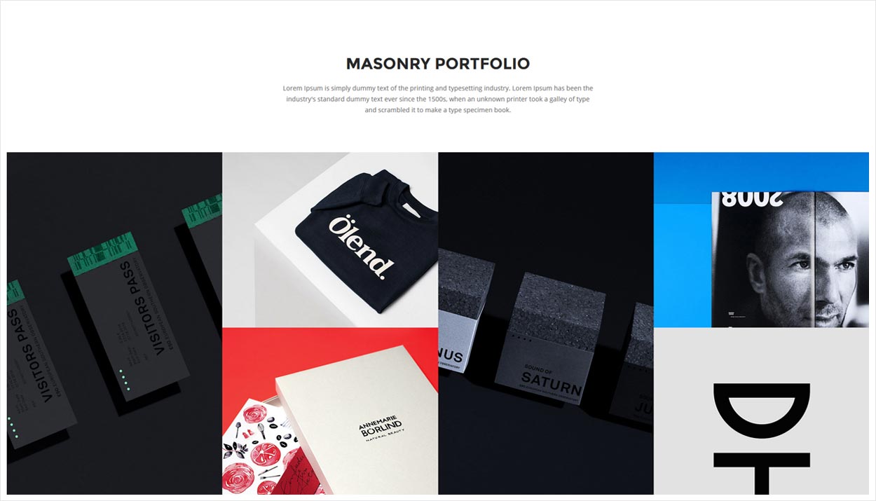
Portfolio Masonry
<div class="container-fluid">
    <div class="row">
        <div class="work-4col wide">
            <div class="col-lg-12 col-md-12 col-sm-12 col-xs-12 no-padding">
                <div class="overflow-hidden grid-gallery">
                    <div class="tab-content">
                        <ul class="masonry-items grid work-gallery grid">
                            <!-- portfolio item -->
                            <li class="html jquery xs-no-padding">
                                <figure>
                                    <div class="gallery-img lightbox-gallery">
                                        <a href="images/agency-work-13.jpg" title=""><img src="images/agency-work-13.jpg" id="tz-bg-118" data-img-size="(W)800px X (H)1300px" alt=""></a>
                                    </div>
                                </figure>
                            </li>
                            <!-- end portfolio item -->
                            <!-- portfolio item -->
                            <li class="magento wordpress xs-no-padding">
                                <figure>
                                    <div class="gallery-img lightbox-gallery">
                                        <a href="images/agency-work-08.jpg" title=""><img src="images/agency-work-08.jpg" id="tz-bg-119" data-img-size="(W)800px X (H)650px" alt=""></a>
                                    </div>
                                </figure>
                            </li>
                            <!-- end portfolio item -->
                            <!-- portfolio item -->
                            <li class="jquery xs-no-padding">
                                <figure>
                                    <div class="gallery-img lightbox-gallery">
                                        <a href="images/agency-work-14.jpg" title=""><img src="images/agency-work-14.jpg" id="tz-bg-120" data-img-size="(W)800px X (H)1300px" alt=""></a>
                                    </div>
                                </figure>
                            </li>
                            <!-- end portfolio item -->
                            <!-- portfolio item -->
                            <li class="html magento jquery xs-no-padding">
                                <figure>
                                    <div class="gallery-img lightbox-gallery">
                                        <a href="images/agency-work-04.jpg" title=""><img src="images/agency-work-04.jpg" id="tz-bg-121" data-img-size="(W)800px X (H)650px" alt=""></a>
                                    </div>
                                </figure>
                            </li>
                            <!-- end portfolio item -->
                            <!-- portfolio item -->
                            <li class="html wordpress magento xs-no-padding">
                                <figure>
                                    <div class="gallery-img lightbox-gallery">
                                        <a href="images/agency-work-02.jpg" title=""><img src="images/agency-work-02.jpg" id="tz-bg-122" data-img-size="(W)800px X (H)650px" alt=""></a>
                                    </div>
                                </figure>
                            </li>
                            <!-- end portfolio item -->
                            <!-- portfolio item -->
                            <li class="wordpress html xs-no-padding">
                                <figure>
                                    <div class="gallery-img lightbox-gallery">
                                        <a href="images/agency-work-06.jpg" title=""><img src="images/agency-work-06.jpg" id="tz-bg-123" data-img-size="(W)800px X (H)650px" alt=""></a>
                                    </div>
                                </figure>
                            </li>
                            <!-- end portfolio item -->
                        </ul>
                    </div>
                </div>
            </div>
        </div>
    </div>
</div>
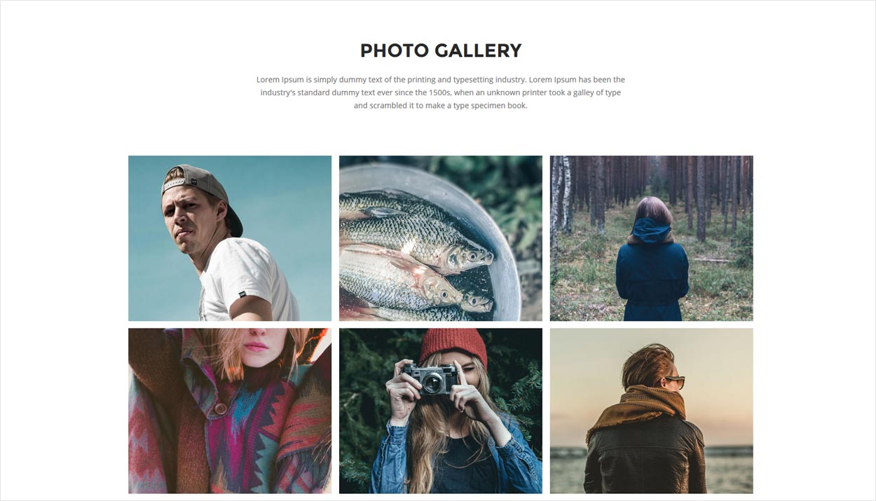
Lightbox Gallery
Magnific Popup is a responsive lightbox & dialog script with focus on performance and providing best experience for user with any device.
Lightbox Gallery
You may put any HTML content in each gallery item and mix content types. In this example lazy-loading of images is enabled for the next image based on move direction.
<div class="container">
    <div class="row">
        <div class="work-3col wide gutter">
            <div class="col-md-12 col-sm-12 col-xs-12">
                <div class="overflow-hidden grid-gallery">
                    <div class="tab-content">
                        <ul class="masonry-items grid">
                            <!-- portfolio item -->
                            <li>
                                <figure>
                                    <div class="gallery-img lightbox-gallery">
                                        <a href="images/event-gallery-01.jpg" title=""><img src="images/event-gallery-01.jpg" id="tz-bg-124" data-img-size="(W)800px X (H)650px" alt=""></a>
                                    </div>
                                </figure>
                            </li>
                            <!-- end portfolio item -->
                            <!-- portfolio item -->
                            <li>
                                <figure>
                                    <div class="gallery-img lightbox-gallery">
                                        <a href="images/event-gallery-02.jpg" title=""><img src="images/event-gallery-02.jpg" id="tz-bg-125" data-img-size="(W)800px X (H)650px" alt=""></a>
                                    </div>
                                </figure>
                            </li>
                            <!-- end portfolio item -->
                            <!-- portfolio item -->
                            <li>
                                <figure>
                                    <div class="gallery-img lightbox-gallery">
                                        <a href="images/event-gallery-03.jpg" title=""><img src="images/event-gallery-03.jpg" id="tz-bg-126" data-img-size="(W)800px X (H)650px" alt=""></a>
                                    </div>
                                </figure>
                            </li>
                            <!-- end portfolio item -->
                            <!-- portfolio item -->
                            <li>
                                <figure>
                                    <div class="gallery-img lightbox-gallery">
                                        <a href="images/event-gallery-04.jpg" title=""><img src="images/event-gallery-04.jpg" id="tz-bg-127" data-img-size="(W)800px X (H)650px" alt=""></a>
                                    </div>
                                </figure>
                            </li>
                            <!-- end portfolio item -->
                            <!-- portfolio item -->
                            <li>
                                <figure>
                                    <div class="gallery-img lightbox-gallery">
                                        <a href="images/event-gallery-05.jpg" title=""><img src="images/event-gallery-05.jpg" id="tz-bg-128" data-img-size="(W)800px X (H)650px" alt=""></a>
                                    </div>
                                </figure>
                            </li>
                            <!-- end portfolio item -->
                            <!-- portfolio item -->
                            <li>
                                <figure>
                                    <div class="gallery-img lightbox-gallery">
                                        <a href="images/event-gallery-06.jpg" title=""><img src="images/event-gallery-06.jpg" id="tz-bg-129" data-img-size="(W)800px X (H)650px" alt=""></a>
                                    </div>
                                </figure>
                            </li>
                            <!-- end portfolio item -->
                            <!-- portfolio item -->
                            <li>
                                <figure>
                                    <div class="gallery-img lightbox-gallery">
                                        <a href="images/event-gallery-07.jpg" title=""><img src="images/event-gallery-07.jpg" id="tz-bg-130" data-img-size="(W)800px X (H)650px" alt=""></a>
                                    </div>
                                </figure>
                            </li>
                            <!-- end portfolio item -->
                            <!-- portfolio item -->
                            <li>
                                <figure>
                                    <div class="gallery-img lightbox-gallery">
                                        <a href="images/event-gallery-08.jpg" title=""><img src="images/event-gallery-08.jpg" id="tz-bg-131" data-img-size="(W)800px X (H)650px" alt=""></a>
                                    </div>
                                </figure>
                            </li>
                            <!-- end portfolio item -->
                            <!-- portfolio item -->
                            <li>
                                <figure>
                                    <div class="gallery-img lightbox-gallery">
                                        <a href="images/event-gallery-09.jpg" title=""><img src="images/event-gallery-09.jpg" id="tz-bg-132" data-img-size="(W)800px X (H)650px" alt=""></a>
                                    </div>
                                </figure>
                            </li>
                            <!-- end portfolio item -->
                        </ul>
                    </div>
                </div>
            </div>
        </div>
    </div>
</div>
Javascript
<script type="text/javascript">
    $('.lightbox-gallery').magnificPopup({
        delegate: 'a',
        type: 'image',
        tLoading: 'Loading image #%curr%...',
        mainClass: 'mfp-fade',
        gallery: {
            enabled: true,
            navigateByImgClick: true,
            preload: [0, 1] // Will preload 0 - before current, and 1 after the current image
        },
        image: {
            tError: '<a href="%url%">The image #%curr%</a> could not be loaded.',
            titleSrc: function (item) {
                return item.el.attr('title');
            }
        }
    });
</script>
Open YouTube/Vimeo/Google Map Video
In this example lightboxes are automatically disabled on small screen size and default behavior of link is triggered.
<div class="margin-ten-bottom"><a class="popup-youtube display-block propClone" href="https://www.youtube.com/watch?v=_xG68lkrMDU"><i class="fa fa-play-circle tz-icon-color title-extra-large-9 xs-title-big3 text-golden-yellow" aria-hidden="true"></i></a></div>
Javascript
<script type="text/javascript">
        $('.popup-youtube, .popup-vimeo, .popup-gmaps').magnificPopup({
        disableOn: 700,
        type: 'iframe',
        mainClass: 'mfp-fade',
        removalDelay: 160,
        preloader: false,
        fixedContentPos: false
        });
</script>
Countdown Timer
This is the HTML part for the Countdown Timer. You just need to change data-enddate attribute value to set your launch date in yyyy/mm/dd format and time in 24 hours format like hh:mm:ss
<!-- timer -->
<div id="counter-event" data-enddate="2016/12/25 12:00:00" class="alt-font float-left width-100"></div>
<!-- end timer -->
Carousel Slider
Touch enabled jQuery plugin that lets you create beautiful responsive carousel slider.

<div class="owl-slider-full owl-carousel owl-theme light-pagination xs-no-owl-buttons">
    <!-- slider item -->
    <div class="item owl-bg-img tz-builder-bg-image cover-background" id="tz-bg-4" data-img-size="(W)1920px X (H)994px" style="background:linear-gradient(rgba(15,15,15,0.75), rgba(15,15,15,0.75)), url('images/bg-image/restaurant-slider-01.jpg')">
        <div class="container one-sixth-screen xs-one-second-screen position-relative">
            <div class="col-md-7 col-sm-10 col-xs-12 margin-lr-auto slider-typography text-center">
                <div class="slider-text-middle-main">
                    <div class="slider-text-middle">
                        <div class="title-extra-large-9 font-weight-700 text-golden-yellow margin-ten-bottom alt-font slider-title tz-text" id="tz-slider-text13">CREATIVE AGENCY</div>
                        <div class="text-extra-large text-light-gray font-weight-400 margin-twelve-bottom xs-margin-twenty-bottom slider-text xs-title-small tz-text width-85 xs-width-95 margin-lr-auto" id="tz-slider-text14"> <p> Lorem Ipsum is simply dummy text of the typesetting industry. Lorem Ipsum has been industry's standard dummy. </p> </div>
                        <div class="btn-dual">
                            <a class="btn btn-large xs-btn-small btn-border btn-circle text-white highlight-button-white-border propClone font-weight-300" id="tz-slider-text15" href="#"><span class="tz-text" id="tz-btn-1">READ MORE</span></a>
                            <a class="btn btn-large xs-btn-small btn-border btn-circle text-white highlight-button-white-border propClone font-weight-300" id="tz-slider-text16" href="#"><span class="tz-text" id="tz-btn-2">DOWNLOAD</span></a>
                        </div>
                    </div>
                </div>
            </div>
        </div>
    </div>
    <!-- end slider item -->
    <!-- slider item -->
    <div class="item owl-bg-img tz-builder-bg-image cover-background" id="tz-bg-5" data-img-size="(W)1920px X (H)994px" style="background:linear-gradient(rgba(15,15,15,0.75), rgba(15,15,15,0.75)), url('images/bg-image/restaurant-slider-02.jpg')">
        <div class="container one-sixth-screen xs-one-second-screen position-relative">
            <div class="col-md-7 col-sm-10 col-xs-12 margin-lr-auto slider-typography text-center">
                <div class="slider-text-middle-main">
                    <div class="slider-text-middle">
                        <div class="title-extra-large-9 font-weight-700 text-golden-yellow margin-ten-bottom alt-font slider-title tz-text" id="tz-slider-text17">TANGIBLE RESULTS</div>
                        <div class="text-extra-large text-light-gray font-weight-400 margin-twelve-bottom xs-margin-twenty-bottom slider-text xs-title-small tz-text width-85 xs-width-95 margin-lr-auto" id="tz-slider-text18"> <p> Lorem Ipsum is simply dummy text of the typesetting industry. Lorem Ipsum has been industry's standard dummy. </p> </div>
                        <div class="btn-dual">
                            <a class="btn btn-large xs-btn-small btn-border btn-circle text-white highlight-button-white-border propClone font-weight-300" id="tz-slider-text266" href="#"><span class="tz-text" id="tz-btn-3">READ MORE</span></a>
                            <a class="btn btn-large xs-btn-small btn-border btn-circle text-white highlight-button-white-border propClone font-weight-300" id="tz-slider-text267" href="#"><span class="tz-text" id="tz-btn-4">DOWNLOAD</span></a>
                        </div>
                    </div>
                </div>
            </div>
        </div>
    </div>
    <!-- end slider item -->
    <!-- slider item -->
    <div class="item owl-bg-img tz-builder-bg-image cover-background" id="tz-bg-6" data-img-size="(W)1920px X (H)994px" style="background:linear-gradient(rgba(15,15,15,0.75), rgba(15,15,15,0.75)), url('images/bg-image/restaurant-slider-03.jpg')">
        <div class="container one-sixth-screen xs-one-second-screen position-relative">
            <div class="col-md-7 col-sm-10 col-xs-12 margin-lr-auto slider-typography text-center">
                <div class="slider-text-middle-main">
                    <div class="slider-text-middle">
                        <div class="title-extra-large-9 font-weight-700 text-golden-yellow margin-ten-bottom alt-font slider-title tz-text" id="tz-slider-text21">PREMIUM DESIGNS</div>
                        <div class="text-extra-large text-light-gray font-weight-400 margin-twelve-bottom xs-margin-twenty-bottom slider-text xs-title-small tz-text width-85 xs-width-95 margin-lr-auto" id="tz-slider-text22"> <p> Lorem Ipsum is simply dummy text of the typesetting industry. Lorem Ipsum has been industry's standard dummy. </p> </div>
                        <div class="btn-dual">
                            <a class="btn btn-large xs-btn-small btn-border btn-circle text-white highlight-button-white-border propClone font-weight-300" id="tz-slider-text268" href="#"><span class="tz-text" id="tz-btn-5">READ MORE</span></a>
                            <a class="btn btn-large xs-btn-small btn-border btn-circle text-white highlight-button-white-border propClone font-weight-300" id="tz-slider-text269" href="#"><span class="tz-text" id="tz-btn-6">DOWNLOAD</span></a>
                        </div>
                    </div>
                </div>
            </div>
        </div>
    </div>
    <!-- end slider item -->
</div>
Javascript
<script type="text/javascript">
    $(document).ready(function () {
        $('.owl-slider-full').owlCarousel({
            navigation: true, // Show next and prev buttons
            slideSpeed: 300,
            items: 3,
            paginationSpeed: 400,
            autoPlay: 5000,
            singleItem: true,
            navigationText: ['<i class="fa fa-long-arrow-left"></i>', '<i class="fa fa-long-arrow-right"></i>']
        });
    });
</script>
You can find the owl slider related documentation here.
Read OWL Slider Document
Carousel Slider - Helper Classes
We have created some helper classes for the Sliders. Here are a few of them:
.opacity-light- For light opacity.opacity-medium- For medium opacity.opacity-full- For full opacity.opacity-full-dark- For extra full opacity.slider-text-middle- Typography text vertical align middle.slider-text-top- Typography text vertical align top.slider-text-bottom- Typography text vertical align bottom.owl-no-pagination- For hide dot pagination.owl-without-next-prev-arrow- For hide next-previous arrow.owl-dark-pagination- For dark dot and arrow pagination.outside-arrow- For slider out side round arrow.outside-arrow-simple- For slider out side simple arrow
Helper Classes
We have created some really useful helper classes for you. Here are a few of them:
Text Size
.text-extra-small- For extra small size of text.text-small2- For small size of text.text-small- For small size of text.text-extra-medium- For extra medium size of text.text-medium- For medium size of text.text-large- For large size of text.text-extra-large- For extra large size of text.title-extra-large-2- For extra large size of title.title-extra-large-3- For extra large size of title.title-extra-large-4- For extra large size of title.title-extra-large-5- For extra large size of title.title-extra-large-6- For extra large size of title.title-extra-large-7- For extra large size of title.title-extra-large-8- For extra large size of title.title-extra-large-9- For extra large size of title.title-big- For very large size of title.title-big-2- For very large size of title.title-big-3- For very large size of title.title-big-4- For very large size of title.title-big-5- For very large size of title.section-title-large- For large section size of title.section-title-medium- For medium section size of title.section-title-small- For small section size of title
Text Color
.text-white- For white color text.text-black- For black color text.text-dark-gray- For dark gray color text.text-light-gray- For light gray color text.text-light-gray2- For light gray two color text.text-medium-gray- For medium gray color text.text-gray- For gray color text.text-yellow- For yellow color text.text-light-yellow- For light yellow color text.text-golden-yellow- For golden yellow color text.text-blue- For blue color text.text-deep-blue- For deep blue color text.text-dark-blue- For dark blue color text.text-fast-blue- For fast blue color text.text-sky-blue-dark- For sky blue dark color text.text-blue-gray- For blue gary color text.text-cyan- For cyan color text.text-deep-red- For deep red color text.text-pink- For pink color text.text-dark-cherry- For dark cherry color text.text-rosy-brown- For rosy brown color text.text-light-red- For light red color text.text-sky-blue- For sky blue color text.text-light-green- For light green color text.text-deep-green- For deep green color text.text-dark-slate-blue- For dark slate blue color text.text-bitter-sweet- For bitter sweet color text.text-orange- For orange color text.text-light-orange- For light orange color text.text-deep-purple- For deep purple color text.text-chrome-yellow- For chrome yellow color text.text-turquoise-green- For turquoise green color text.text-brown- For brown color text.text-golden- For golden color text.text-sand-yellow- For sand yellow color text.text-light-purple-blue- For light purple blue color text.text-light-blue- For light blue color text.text-fast-blue2- For fast blue two color text.text-puerto-rico- For puerto rico color text.text-orange-peel- For orange peel color text.text-greenish-blue- For greenish blue color text.text-dark-speech-blue- For dark speech blue color text.text-yellow-ochre- For yellow ochre color text.text-yellowish-gray- For yellowish gray color text.text-light-deep-yellow- For light deep yellow color text.text-dark-aqua- For dark aqua color text.text-emerald- For emerald color text.text-deep-green-dark- For deep green dark color text.text-deep-blue-dark- For deep blue dark color text.text-very-light-gray- For very light gray color text.text-fast-pink- For fast pink color text.text-meteorite- For meteorite color text.text-cinnabar- For cinnabar color text.text-poison-green- For poison green color text.text-dark-bitter-sweet- For dark bitter sweet color text.text-red- For red color text
Text Align
.text-left- For text align left.text-right- For text align right.text-center- For text align center.text-justify- For text align justify
Text Transform
.text-lowercase- For text to lowercase.text-uppercase- For text to uppercase
Letter Spacing
.no-letter-spacing- For letter spacing of none.letter-spacing-1- For letter spacing of 1 pixel.letter-spacing-2- For letter spacing of 2 pixel.letter-spacing-3- For letter spacing of 3 pixel.letter-spacing-4- For letter spacing of 4 pixel.letter-spacing-5- For letter spacing of 5 pixel.letter-spacing-6- For letter spacing of 6 pixel.letter-spacing-7- For letter spacing of 7 pixel.letter-spacing-8- For letter spacing of 8 pixel.letter-spacing-9- For letter spacing of 9 pixel.letter-spacing-10- For letter spacing of 10 pixel.letter-spacing-minus-1- For letter spacing of -1 pixel.letter-spacing-minus-2- For letter spacing of -2 pixel.letter-spacing-minus-3- For letter spacing of -3 pixel.letter-spacing-minus-4- For letter spacing of -4 pixel.letter-spacing-minus-5- For letter spacing of -5 pixel.letter-spacing-minus-6- For letter spacing of -6 pixel
Font Weight
.font-weight-100- For font weight of 100.font-weight-300- For font weight of 300.font-weight-400- For font weight of 400.font-weight-600- For font weight of 600.font-weight-700- For font weight of 700
Icon Size
.icon-extra-big- For extra big icon size.icon-big- For big icon size.icon-extra-large- For extra large icon size.icon-large- For large icon size.icon-medium- For medium icon size.icon-small- For small icon size.icon-extra-small- For extra small icon size
Background Color
.bg-white- For background color of white.bg-black- For background color of black.bg-gray- For background color of gray.bg-brown- For background color of brown.bg-light-gray- For background color of light gray.bg-dark-gray- For background color of dark gray.bg-middle-gray- For background color of medium gray.bg-dark-blue- For background color of dark blue.bg-fast-blue- For background color of fast blue.bg-blue- For background color of blue.bg-deep-blue- For background color of deep blue.bg-sky-blue- For background color of sky blue.bg-sky-blue-dark- For background color of sky blue dark.bg-cyan- For background color of cyan.bg-light-cyan- For background color of light cyan.bg-cream- For background color of cream.bg-dark-cream- For background color of dark cream.bg-dark-cherry- For background color of dark cherry.bg-pink- For background color of pink.bg-deep-red- For background color of deep red.bg-rosy-brown- For background color of rosy brown.bg-light-red- For background color of light red.bg-deep-purple- For background color of deep purple.bg-light-green- For background color of light green.bg-medium-green- For background color of medium green.bg-deep-green- For background color of deep green.bg-yellow- For background color of yellow.bg-light-yellow- For background color of light yellow.bg-golden-yellow- For background color of golden yellow.bg-purple- For background color of purple.bg-dark-slate-blue- For background color of dark slate blue.bg-bitter-sweet- For background color of bitter sweet.bg-scarlet-gum- For background color of scarlet gum.bg-orange- For background color of orange.bg-light-orange- For background color of light orange.bg-chrome-yellow- For background color of chrome yellow.bg-gray-yellow- For background color of gray yellow.bg-very-light-gray- For background color of very light gray.bg-turquoise-green- For background color of turquoise green.bg-golden- For background color of golden.bg-deep-orange- For background color of deep orange.bg-sand-yellow- For background color of sand yellow.bg-sand-yellow-dark- For background color of dark sand yellow.bg-dark-purple-blue- For background color of dark purple blue.bg-light-blue- For background color of light blue.bg-puerto-rico- For background color of puerto rico.bg-orange-peel- For background color of orange peel.bg-greenish-blue- For background color of greenish blue.bg-dark-speech-blue- For background color of dark speech blue.bg-light-deep-yellow- For background color of light deep yellow.bg-yellow-ochre- For background color of yellow ochre.bg-yellowish-gray- For background color of yellowish gray.bg-aqua- For background color of aqua.bg-emerald- For background color of emerald.bg-mongoose- For background color of mongoose.bg-deep-green-dark- For background color of deep green dark.bg-deep-blue-dark- For background color of deep blue dark.bg-light-purple-blue- For background color of light purple blue.bg-middle-light-gray- For background color of middle light gray.bg-cod-grey- For background color of cod grey.bg-charcoal- For background color of charcol.bg-black-russian- For background color of black russian.bg-light-gray2- For background color of light gray two.bg-dark-gray2- For background color of dark gray two.bg-fast-pink- For background color of fast pink.bg-fast-blue2- For background color of fast blue two.bg-meteorite- For background color of meteorite.bg-cinnabar- For background color of cinnabar.bg-poison-green- For background color of poison green.bg-light-bitter-sweet- For background color of light bitter sweet.bg-red- For background color of red
RGBA Background color
.bg-cyan-rgba- For background color of cyan.bg-white-light-rgba- For background color of light white.bg-black-light-rgba- For background color of light black.bg-black-dark-rgba- For background color of dark black.bg-greenish-blue-rgba- For background color of greenish blue.bg-orange-rgba- For background color of orange.bg-black-medium-rgba- For background color of medium black
Background Image
.fix-background- For background image attachment fixed.cover-background- For background image cover
Opacity
.only-opacity-light- For only light opacity.opacity-light- For light opacity.opacity-medium- For medium opacity.opacity-full- For full opacity.opacity-full-dark- For extra full opacity
Margin
.margin-one-half- Margin of 0.5% on each side.margin-one- Margin of 1% on each side.margin-two- Margin of 1.5% on each side.margin-three- Margin of 2% on each side.margin-four- Margin of 2.5% on each side.margin-five- Margin of 3% on each side.margin-six- Margin of 3.5% on each side.margin-seven- Margin of 4% on each side.margin-eight- Margin of 4.5% on each side.margin-nine- Margin of 5% on each side.margin-ten- Margin of 5.5% on each side.margin-eleven- Margin of 6% on each side.margin-twelve- Margin of 6.5% on each side.margin-thirteen- Margin of 7% on each side.margin-fourteen- Margin of 7.5% on each side.margin-fifteen- Margin of 8% on each side.margin-sixteen- Margin of 8.5% on each side.margin-seventeen- Margin of 9% on each side.margin-eighteen- Margin of 9.5% on each side.margin-nineteen- Margin of 10% on each side.margin-twenty- Margin of 10.5% on each side.margin-twenty-one- Margin of 11% on each side.margin-twenty-two- Margin of 11.5% on each side.margin-twenty-three- Margin of 12% on each side.margin-twenty-four- Margin of 12.5% on each side.margin-twenty-five- Margin of 13% on each side.margin-twenty-six- Margin of 13.5% on each side.margin-twenty-seven- Margin of 14% on each side.margin-twenty-eight- Margin of 14.5% on each side.margin-twenty-nine- Margin of 15% on each side.margin-thirty- Margin of 15.5% on each side.margin-thirty-one- Margin of 16% on each side.margin-thirty-two- Margin of 16.5% on each side.margin-thirty-three- Margin of 17% on each side.margin-thirty-four- Margin of 17.5% on each side.margin-thirty-five- Margin of 18% on each side.no-margin- No margin of on the all side.no-margin-lr- No margin of on the left and right side.no-margin-tb- No margin of on the top and bottom side.no-margin-top- No margin of on the top side.no-margin-bottom- No margin of on the bottom side.no-margin-left- No margin of on the left side.no-margin-right- No margin of on the right side.margin-lr-autoMargin auto of on the left and right side
Padding
.padding-one-half- Padding of 0.5% on each side.padding-one- Padding of 1% on each side.padding-two- Padding of 1.5% on each side.padding-three- Padding of 2% on each side.padding-four- Padding of 2.5% on each side.padding-five- Padding of 3% on each side.padding-six- Padding of 3.5% on each side.padding-seven- Padding of 4% on each side.padding-eight- Padding of 4.5% on each side.padding-nine- Padding of 5% on each side.padding-ten- Padding of 5.5% on each side.padding-eleven- Padding of 6% on each side.padding-twelve- Padding of 6.5% on each side.padding-thirteen- Padding of 7% on each side.padding-fourteen- Padding of 7.5% on each side.padding-fifteen- Padding of 8% on each side.padding-sixteen- Padding of 8.5% on each side.padding-seventeen- Padding of 9% on each side.padding-eighteen- Padding of 9.5% on each side.padding-nineteen- Padding of 10% on each side.padding-twenty- Padding of 10.5% on each side.padding-twenty-one- Padding of 11% on each side.padding-twenty-two- Padding of 11.5% on each side.padding-twenty-three- Padding of 12% on each side.padding-twenty-four- Padding of 12.5% on each side.padding-twenty-five- Padding of 13% on each side.padding-twenty-six- Padding of 13.5% on each side.padding-twenty-seven- Padding of 14% on each side.padding-twenty-eight- Padding of 14.5% on each side.padding-twenty-nine- Padding of 15% on each side.padding-thirty- Padding of 15.5% on each side.padding-thirty-one- Padding of 16% on each side.padding-thirty-two- Padding of 16.5% on each side.padding-thirty-three- Padding of 17% on each side.padding-thirty-four- Padding of 17.5% on each side.padding-thirty-five- Padding of 18% on each side.no-padding- No padding at all.no-padding-lr- No padding in left and right.no-padding-tb- No padding in top and bottom.no-padding-top- No padding in top.no-padding-bottom- No padding in bottom.no-padding-left- No padding in left.no-padding-right- No padding in right
Float
.pull-left- Float DIV to left.pull-right- Float DIV to right
Display
.display-block- For display block.display-inline-block- For display inline-block.display-inline- For display inline.display-inherit- For display inherit.display-none- For display none.display-table- For display table.display-table-cell-vertical-middle- For display table vertical middle.display-table-cell-vertical-bottom- For display table vertical bottom.overflow-hidden- For overflow hidden.overflow-auto- For overflow auto
Position
.position-relative- For element position relative.position-absolute- For element position absolute.position-fixed- For element position fixed.position-inherit- For element position inherit.position-static- For element position static.position-right- For element position fixed to right of the body or parent element.position-left- For element position fixed to left of the body or parent element.position-top- For element position fixed to top of the body or parent element.position-bottom- For element position fixed to bottom of the body or parent element
Position Top
.top-3For element position 3px down from the top of the parent element/div.top-4For element position 4px down from the top of the parent element/div.top-5For element position 5px down from the top of the parent element/div.top-6For element position 6px down from the top of the parent element/div.top-7For element position 7px down from the top of the parent element/div.top-8For element position 8px down from the top of the parent element/div.top-9For element position 9px down from the top of the parent element/div.top-10For element position 10px down from the top of the parent element/div
.top-minus1For element position 1px up from the top of the parent element/div.top-minus2For element position 2px up from the top of the parent element/div.top-minus3For element position 3px up from the top of the parent element/div.top-minus4For element position 4px up from the top of the parent element/div.top-minus5For element position 5px up from the top of the parent element/div.top-minus6For element position 6px up from the top of the parent element/div.top-minus7For element position 7px up from the top of the parent element/div.top-minus8For element position 8px up from the top of the parent element/div.top-minus9For element position 9px up from the top of the parent element/div.top-minus10For element position 10px up from the top of the parent element/div
Position left
.left-1For element position 3px down from the left of the parent element/div.left-2For element position 3px down from the left of the parent element/div.left-3For element position 3px down from the left of the parent element/div.left-4For element position 4px down from the left of the parent element/div.left-5For element position 5px down from the left of the parent element/div.left-6For element position 6px down from the left of the parent element/div.left-7For element position 7px down from the left of the parent element/div.left-8For element position 8px down from the left of the parent element/div.left-9For element position 9px down from the left of the parent element/div.left-10For element position 10px down from the left of the parent element/div
.left-minus1For element position 3px up from the left of the parent element/div.left-minus2For element position 3px up from the left of the parent element/div.left-minus3For element position 3px up from the left of the parent element/div.left-minus4For element position 4px up from the left of the parent element/div.left-minus5For element position 5px up from the left of the parent element/div.left-minus6For element position 6px up from the left of the parent element/div.left-minus7For element position 7px up from the left of the parent element/div.left-minus8For element position 8px up from the left of the parent element/div.left-minus9For element position 9px up from the left of the parent element/div.left-minus10For element position 10px up from the left of the parent element/div
Position bottom
.bottom-3For element position 3px down from the bottom of the parent element/div.bottom-4For element position 4px down from the bottom of the parent element/div.bottom-5For element position 5px down from the bottom of the parent element/div.bottom-6For element position 6px down from the bottom of the parent element/div.bottom-7For element position 7px down from the bottom of the parent element/div.bottom-8For element position 8px down from the bottom of the parent element/div.bottom-9For element position 9px down from the bottom of the parent element/div.bottom-10For element position 10px down from the bottom of the parent element/div
Width
.width-15- For width of 15% on DIV/Text.width-20- For width of 20% on DIV/Text.width-25- For width of 25% on DIV/Text.width-30- For width of 30% on DIV/Text.width-35- For width of 35% on DIV/Text.width-40- For width of 40% on DIV/Text.width-45- For width of 45% on DIV/Text.width-50- For width of 50% on DIV/Text.width-55- For width of 55% on DIV/Text.width-60- For width of 60% on DIV/Text.width-65- For width of 65% on DIV/Text.width-70- For width of 70% on DIV/Text.width-75- For width of 75% on DIV/Text.width-80- For width of 80% on DIV/Text.width-85- For width of 85% on DIV/Text.width-90- For width of 90% on DIV/Text.width-95- For width of 95% on DIV/Text.width-100- For width of 100% on DIV/Text.width-auto- For width of auto on DIV/Text
Height
.height-20- For height of 20% on DIV/Text.height-25- For height of 25% on DIV/Text.height-30- For height of 30% on DIV/Text.height-35- For height of 35% on DIV/Text.height-40- For height of 40% on DIV/Text.height-45- For height of 45% on DIV/Text.height-50- For height of 50% on DIV/Text.height-55- For height of 55% on DIV/Text.height-60- For height of 60% on DIV/Text.height-65- For height of 65% on DIV/Text.height-70- For height of 70% on DIV/Text.height-75- For height of 75% on DIV/Text.height-80- For height of 80% on DIV/Text.height-85- For height of 85% on DIV/Text.height-90- For height of 90% on DIV/Text.height-95- For height of 95% on DIV/Text.height-100- For height of 100% on DIV/Text.min-height- For min height of 100% on DIV/Text
One Pixel Border
.border-light- For one pixel light border.border-dark- For one pixel dark border.border-top- For one pixel top border.border-right- For one pixel right border.border-top-light- For one pixel top light border.border-bottom- For one pixel bottom border.border-bottom-medium-dark- For one pixel bottom medium dark border.border-bottom-light- For one pixel bottom light border
Two Pixel Border
.border-2-white- For two pixel white border.border-2-fast-blue- For two pixel fast blue border.border-2-light-green- For two pixel light green border.border-2-medium-green- For two pixel medium green border.border-2-deep-green- For two pixel deep green border.border-2-light-green- For two pixel light green border.border-2-sky-blue- For two pixel sky blue border.border-2-sky-blue-dark- For two pixel dark sky blue border.border-2-light-gray- For two pixel light gray border.border-2-dark-gray- For two pixel dark gary border.border-2-bitter-sweet- For two pixel bitter sweet border.border-2-yellow- For two pixel yellow border.border-2-chrome-yellow- For two pixel chrome yellow border.border-2-turquoise-green- For two pixel turquoise green border.border-2-golden- For two pixel golden border.border-2-deep-orange- For two pixel deep orange border.border-2-orange-peel- For two pixel peel orange border.border-greenish-blue- For two pixel greenish blue border.border-2-dark-aqua- For two pixel dark aqua border.border-2-deep-green-dark- For two pixel dark green border.border-2-deep-blue-dark- For two pixel dark deep blue border.border-2-orange- For two pixel orange border.border-2-fast-blue2- For two pixel fast blue border.border-2-red- For two pixel red border.border-2-cinnabar- For two pixel cinnabar border.border-2-poison-green- For two pixel poison green border
.border-3-bitter-sweet- For three pixel bitter sweet border.border-10-light-red- For ten pixel light red border.img-border- For image six pixel white border
Border Radius
.border-radius-0- For zero pixel radius border.border-radius-2- For two pixel radius border.border-radius-3- For three pixel radius border.border-radius-4- For four pixel radius border.border-radius-6- For six pixel radius border.border-radius-8- For eight pixel radius border.border-radius-10- For ten pixel radius border.border-radius-20- For twenty pixel radius border.border-radius-30- For thirty pixel radius border.border-radius-40- For forty pixel radius border.border-radius-50- For fifty pixel radius border.border-radius-100- For hundred pixel radius border
Each Side Border None
.border-none- For border none.border-top-none- For border top none.border-bottom-none- For border bottom none.border-left-none- For border left none.border-right-none- For border right none
Useful Tips
You can add link/button which direct you to other section of the same page with smooth scroll effect like it is one page website. You just need to add class: inner-link and href should be the ID of the section as per the example shown below:
<a href="#home" class="inner-link">Home</a>
NotePlease note that destination section should have valid ID.
Form API Integration
The heart of the landing page is lead generation using forms and that is very well taken care by having lots of readymade forms with data validation and also those can be integrated easily with your lovely desired email managing platforms like AWeber, Mailchimp, Active Campaign, Campaign Monitor, Get Response, Mailer Lite as well as custom form to email. We didn’t forgot to provide Google Captcha integration in forms for security and to stop spams. Click on Export button and select form type (AWeber, ActiveCampaign, Custom Email, CampaginMonitor, GetResponse, Mailchimp or MailerLite) and fill the required information for the form type that you selected.
Aweber
Integrate Aweber mail service in signup form, you have to enter the following information.
- Get your List name - https://www.aweber.com/users/autoresponder/manage
Active Campaign
Integrate Active Campaign mail service in signup form, you have to enter the following information.
- Get your API URL – Login to http://www.activecampaign.com/ and Go to My Settings > Developers.
- Get your API Key - Login to http://www.activecampaign.com/ and Go to My Settings > Developers.
- Enter List ID of your created list in Active Campaign.
Custom Email
Integrate Custom Email in signup form, you have to enter the following information.
- Email - The email which will receive the leads.
- Subject - The subject of the email.
Campagin Monitor
Integrate Campagin Monitor mail service in signup form, you have to enter the following information
- Get your API Key - YOUR-USERNAME.createsend.com/admin/account/
- Get your List ID - www.campaignmonitor.com/api/getting-started/#listid
Get Response
Integrate GetResponse mail service in signup form, you have to enter the following information.
- Get your API Key - app.getresponse.com/my_api_key.html
- Get your Campaign name - app.getresponse.com/campaign_list.html
Mailchimp
Integrate Mailchimp mail service in signup form, you have to enter the following information.
- Get your API Key - http://admin.mailchimp.com/account/api
- Get your List Unique ID - http://admin.mailchimp.com/lists/
Mailchimp list default fields are EMAIL, FNAME and LNAME but If you have any other fields in the form you are using then you will need to do some code changes in this file: /tz_mail/mailchimp_api/Mailchimp.php and this function: themezaa_mailchimp_add_subscriber in your exported package to have your additional form fields data transferred properly to your Mailchimp list.
Original Code:
$data = array(
        'apikey'        => $api_key,
        'email_address' => $email,
        'status'        => $status,
        'merge_fields'  => array('FNAME' => $user_name,'LNAME'=> $last_name)
    );
Now suppose you have additional field phone number in your list then please get that field ID (suppose it is PHONE) and add it in the array above to have final code like below:
$data = array(
        'apikey'        => $api_key,
        'email_address' => $email,
        'status'        => $status,
        'merge_fields'  => array('FNAME' => $user_name,'LNAME'=> $last_name,'PHONE'=> $phone_num)
    );
MailerLite
Integrate MailerLite mail service in signup form, you have to enter the following information.
- Get your API Key - https://app.mailerlite.com/integrations/api/
- Get your Group ID - https://app.mailerlite.com/integrations/api/
How to Setup Forms After Export & in Predefined Demo
If you are using predefined landing pages or exported landing pages from LeadGen Builder and want to edit the Form Type for the forms in the page then please follow below steps.
- Open the folder "tz_mail".
- Open the file "api-config.php".
- In line number (2) input the email service provider that you want to use as following:
- "tz_aweber" for AWeber.
- "tz_active" for Active Campaign.
- "tz_custom" for Custom Email.
- "tz_campain" for Campaign Monitor.
- "tz_response" for GetResponse.
- "tz_mailchimp" for Mailchimp.
- "tz_mailerlite" for MailerLite.
- For the used email service provider enter the required information as following:
- Aweber setting line (11), enter your List Name.
- Active Campaign setting lines (17 & 18 & 19), enter your API URL, API Key and List ID.
- Custom Email setting lines (22 & 23), enter your Email address and Email's subject.
- Campaign Monitor setting lines (31 & 32), enter API Key and List ID.
- GetResponse setting lines (39 & 40), enter API Key and Campaign Token.
- Mailchimp setting lines (47 & 48), enter API Key and List ID.
- MailerLite setting lines (54 & 55), enter API Key and Group ID.
- Save the file and your form will be ready to use.
Your email subscription form will not work unless you have your files running on a hosting server with PHP / JS. When you have your files ready on your hosting server, you need to edit the settings to make the email function work.
Open "tz_mail/contact.php" and in line (131) change email address with "noreply@yourdomain.com" to your real email address, same way you can change subject line with replace of text "Contact us form details". Also replace yourdomain.com with your real domain name in logo image url in the email body template (http://www.yourdomain.com/images/logo-mail.png).
Demo Email Template
Open "tz_mail/demoname-contact.php" or "tz_mail/subscribe-contact.php" or "tz_mail/hero-contact.php" (depends on which form setup) change your from email address (Receiver Email Address) at the top with "info@yourdomain.com" to your real email address and also change with "noreply@yourdomain.com", same way you can change subject line with replace of text "Contact us form details". Also replace yourdomain.com with your real domain name in logo image url in the email body template (http://www.yourdomain.com/images/logo-mail.png).
Please feel free to contact us in case if your email feature does not work because some server settings do not allow normal PHP email function.
Note if you want to integrate API mail service in Predefined HTML demo then replace class "default-submit" , "subscribe-submit" and "hero-submit" to "tz_submit".
How to Setup Google reCAPTCHA in forms
Integrate reCAPTCHA in forms you should following below steps
- First, we need an API key, so head on over to https://www.google.com/recaptcha/admin. To gain access to this page you'll need to be logged into a Google account. You'll be asked to register your website, so give it a suitable name, then list domains (for example yourdomain.com) where this particular reCAPTCHA will be used. Subdomains (such as webdesign.yourdomain.com and code.yourdomain.com) are automatically taken into account.
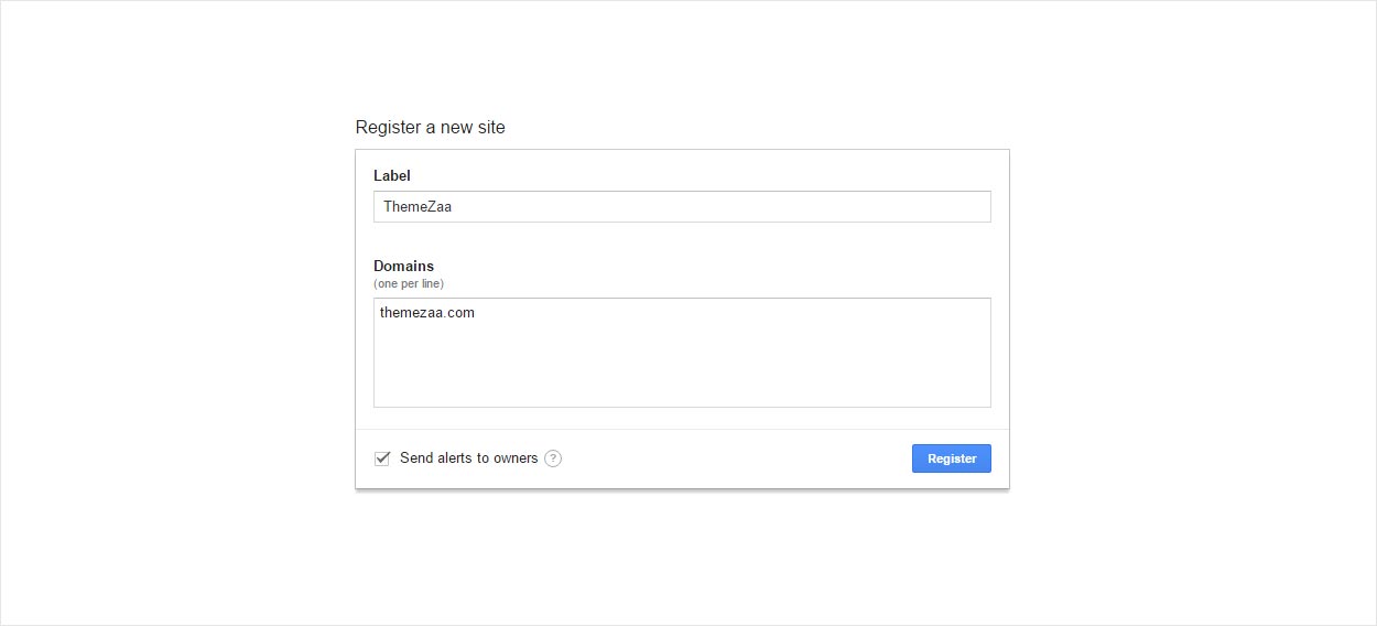
- After above step complete successfully, you'll get a site key and its partner secret key:
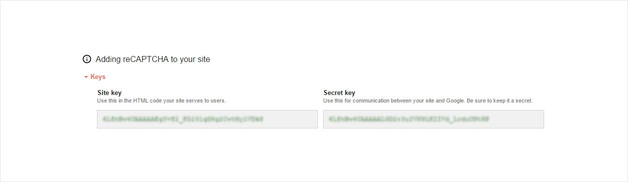
- Underneath the keys you'll see some snippets for including reCAPTCHA on your page. First up there's the JavaScript:
<script src='https://www.google.com/recaptcha/api.js'></script>
You can also define which of the 40 supported languages you're using by adding a parameter to the string. Here we're adding es which will give us a Spanish language reCAPTCHA:
<script src='https://www.google.com/recaptcha/api.js?hl=es'></script>
Place this script tag at the footer of your page (or just underneath the form where the reCAPTCHA will appear, depending on how you prioritize your asset loading).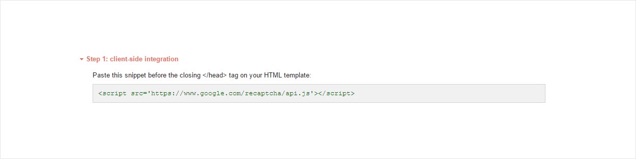
- You'll need to add to your form markup wherever you want the reCAPTCHA to appear:
<div class="g-recaptcha" data-sitekey="6LfnBw4UAAAAAEgYvf2_11112143254544465"></div>
This is an example of a form with recaptcha code: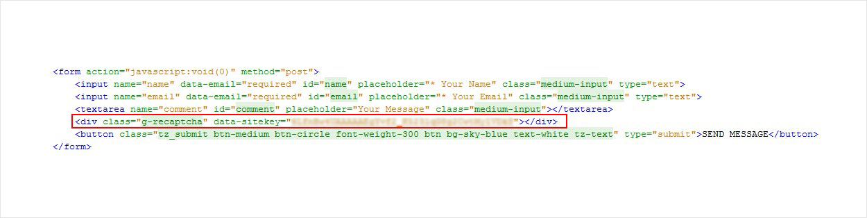
- After that the reCAPTCHA will be ready to use.
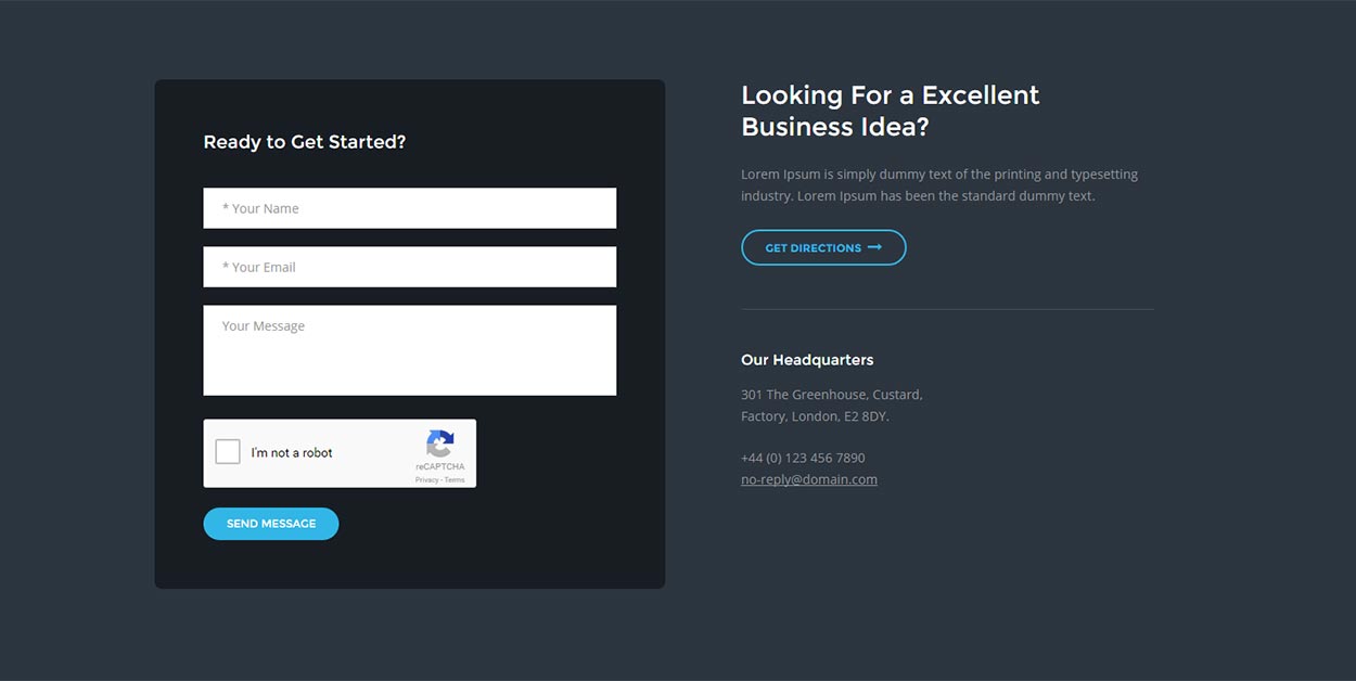
NoteGoogle reCAPTCHA will work in register domain only. It will not work in local server.
Add new fields in form - LeadGen Builder
If you are using LeadGen builder and want to add new fields in form then you have to follow below steps:
- Go to LeadGen Builder and simply add contact block to page and switch to "Block Building Mode" and click on source button.
OR
Open your ".html" file in which you want add new field in contact form. - Add your text input field OR select tag (For Dropdown) OR textarea with unique id and name of field. See below example for text input field. Remove data-email="required" from below line if you dont want to make it as required field.
<input type="text" name="NameOffield" data-email="required" id="IdOfField" placeholder="* Your Name" class="medium-input">
- After updating above item click on "Export" button and extract downloaded .zip file. In extracted files, go to "tz_mail" folder and open "contact.php" file.
- Go to line(38) and copy that line and paste after line(38).
Copy below line and paste it after that.
$comment = $input_extra['comment'];

Suppose your new field name is "newfieldname" then pasted code should be change like below.
$newfieldname = $input_extra['newfieldname'];
- Find "themezaa_email" function, it will be looks like below.
function themezaa_email($subscribe_email,$user_name,$phone_num,$comment,$purchase_email,$email_subject,$msg_php_email_sent,$msg_php_email_not_sent) { $to = $purchase_email; $from_email = 'noreply@themezaa.com'; $subject = $email_subject; $phone_num = $phone_num; $comment = $comment; ... ... ... ..... - Now add new parameter in "themezaa_email" function for new field of form. So it will be like below after addition of new parameter $newfieldname in "themezaa_email" function.
function themezaa_email($subscribe_email,$user_name,$phone_num,$comment,$purchase_email,$email_subject,$msg_php_email_sent,$msg_php_email_not_sent,$newfieldname) { $to = $purchase_email; $from_email = 'noreply@themezaa.com'; $subject = $email_subject; $phone_num = $phone_num; $comment = $comment; ... ... ... ..... - Now add new parameter in email body content, simply copy below TR tag full line and change text "Name" with your new field name and replace variable $user_name with your new parameter name $newfieldname and then paste it in $message string where exactly you want to show it.
<tr>
<td align='right' valign='top' style='border-top:1px solid #dfdfdf; font-family:Arial, Helvetica, sans-serif; font-size:13px; color:#000; padding:7px 5px 7px 0;'>Name:</td>
<td align='left' valign='top' style='border-top:1px solid #dfdfdf; font-family:Arial, Helvetica, sans-serif; font-size:13px; color:#000; padding:7px 0 7px 5px;'>".$user_name."</td>
</tr>
$message string code for your information$message .= "<html> <head> <title>HTML email</title> </head> <body> <table width='50%' border='0' align='center' cellpadding='0' cellspacing='0'> <tr> <td colspan='2' align='center' valign='top'><img style=' margin-top: 15px; ' src='http://www.themezaa.com/html/leadgen/builder/images/logo-black-big.png' ></td> </tr> <tr> <td width='50%' align='right'> </td> <td align='left'> </td> </tr> <tr> <td align='right' valign='top' style='border-top:1px solid #dfdfdf; font-family:Arial, Helvetica, sans-serif; font-size:13px; color:#000; padding:7px 5px 7px 0;'>Name:</td> <td align='left' valign='top' style='border-top:1px solid #dfdfdf; font-family:Arial, Helvetica, sans-serif; font-size:13px; color:#000; padding:7px 0 7px 5px;'>".$user_name."</td> </tr> - Now find all areas in contact.php file where we are calling function themezaa_email, you needs to pass new parameters to function themezaa_email.
You can find such lines in contact.php file.

    themezaa_email($subscribe_email,$user_name,$phone_num,$comment,$purchase_email,$email_subject,$msg_php_email_sent,$msg_php_email_not_sent);

So you needs to pass new parameter with same variable you have created in point 4. In our example it was $newfieldname.


themezaa_email($subscribe_email,$user_name,$phone_num,$comment,$purchase_email,$email_subject,$msg_php_email_sent,$msg_php_email_not_sent,$newfieldname);
Add new fields in form - Demo Template Pages
If you are using Premade demos and want to add new fields in form then you have to follow below steps:
- Open .html page in text editor in which you want to add new form fields.
- Add your text input field OR select tag (For Dropdown) OR textarea with unique id and name of field. See below example for text input field.
<input type="text" name="NameOffield" id="IdOfField" placeholder="* Your Name" class="medium-input">
- Enter your input Field OR Select tag (For Dropdown) OR Textarea with unique id and name.
- Now open "js/main.js" file and find css class of form submit button "default-submit" OR "subscribe-submit" OR "hero-submit" in main.js file. This are functions which is calling on button click event. Suppose your page is using "default-submit" css class in submit button then there will be function like below in main.js file.
$('.default-submit').on('click', function (event) { event.preventDefault(); . .. ... - Now find below line in same jquery function.
var name = $('#' + section_id).find('[name=name]').val();

Copy above line and paste it after copied line and change variable name and field name like below.

var yourvariablename = $('#' + section_id).find('[name=your-field-name]').val(); - Now find "data: {" in same jquery function and assign new defined field variable here so it can be like below.
data: {name: name, email: email, comment: comment,yourvariablename: yourvariablename}, - Now if you want to make new added field as required field then please copy below code and update your field name and paste it in same jquery function under other same type of code.
- Now find text "$.post("tz_mail" in same jquery function, you can see .php page name there. Open that particular .php file from "tz_mail" folder.
Find below text. $from = $_POST['data']['email']; Copy above text and paste it after that, please change 'email' to yourvariablename (same variable name as you have defined in point 6) and also change vairable name $from to $yourvariablename. so it can be like below: $yourvariablename = $_POST['data']['yourvariablename'];
- Now add new field in email body content, simply copy below TR tag full line and change text "Name" with your new field name and replace variable $user_name with your $yourvariablename (same variable name as you have defined in point 8) and then paste it in $message string where exactly you want to show it.
<tr> <td align='right' valign='top' style='border-top:1px solid #dfdfdf; font-family:Arial, Helvetica, sans-serif; font-size:13px; color:#000; padding:7px 5px 7px 0;'>Name:</td> <td align='left' valign='top' style='border-top:1px solid #dfdfdf; font-family:Arial, Helvetica, sans-serif; font-size:13px; color:#000; padding:7px 0 7px 5px;'>".$user_name."</td> </tr>
$message string code for your information$message .= "<html> <head> <title>HTML email</title> </head> <body> <table width='50%' border='0' align='center' cellpadding='0' cellspacing='0'> <tr> <td colspan='2' align='center' valign='top'><img style=' margin-top: 15px; ' src='http://www.themezaa.com/html/leadgen/builder/images/logo-black-big.png' ></td> </tr> <tr> <td width='50%' align='right'> </td> <td align='left'> </td> </tr> <tr> <td align='right' valign='top' style='border-top:1px solid #dfdfdf; font-family:Arial, Helvetica, sans-serif; font-size:13px; color:#000; padding:7px 5px 7px 0;'>Name:</td> <td align='left' valign='top' style='border-top:1px solid #dfdfdf; font-family:Arial, Helvetica, sans-serif; font-size:13px; color:#000; padding:7px 0 7px 5px;'>".$user_name."</td> </tr>
if (yourvariablename == "")
{
    $('#' + section_id).find('[name=your-field-name]').addClass('tz_input_error');
    $('#loading').remove();
    tz_process = false;
}
else
{
    $('#' + section_id).find('[name=your-field-name]').removeClass('tz_input_error');
    tz_process = true;
}
Add Different Email Subject line in Forms - LeadGen Builder
If you want to add diffetrent email subject line in different forms then please follow below steps:
- Define unique ID in each section tag or footer tag where you are using forms. For example see below:
<section class="padding-110px-tb bg-white builder-bg contact-form-style1 xs-padding-60px-tb" id="contact-section9">

<footer id="footer-section17" class="bg-dark-gray padding-60px-tb xs-padding-40px-tb builder-bg">
- Go to "tz_mail" folder and open "contact.php" if you are using file which is exported from LeadGen Builder.
NoteFor Predefined demos, you will have already seperate XYZ-contact.php file and you can easily change subject line there and you don't needs to follow below steps. - Go to line(16) and find below text.
$email_subject = $tz_subject;
Replace above line with below text. Here sectionid1, sectionid2, sectionid3 are section id that you defined in point 1. You can change email subject line as you wish.
$email_id = $_POST['data']['section_id'];
if($email_id == 'sectionid1')
{
    $email_subject = 'Email subject line 1';
}
else if($email_id == 'sectionid2')
{
    $email_subject = 'Email subject line 2';
}
else if($email_id == 'sectionid3')
{
    $email_subject = 'Email subject line 3';
}
else
{
    $email_subject = $tz_subject;
}
Credits
We would really love to take this opportunity to appreciate guys whose items were helpful to us to make LeadGen a really beautiful theme for our awesome users:
Images and Videos
jQuery
Version 1.8
Released on 3rd Jan 2024 - Current
- Added: Added new demo landing page for Cryptocurrency
- Fixed: Fixed the issue of zero byte zip download in some server config
Version 1.7
Released on 12th Feb 2018 - Current
- Added: Added new demo landing page for charity
Version 1.6.1
Released on 19th April 2017
- Added: Added favicon icon upload feature in the builder
- Changed: Enabled auto play sliders in exported page from the builder
- Fixed: Fixed issue of contact forms in PHP 7
- Fixed: Fixed issue of the control going to top on click of Source button in the section in Mac Chrome
Version 1.6
Released on 15th March 2017
- Added: Added new demo landing page for Barber
- Added: Added new 8 header style elements in the builder
- Added: Added 6 new elements for content, contact us, slider, full width image and pricing table
- Added: Added pending status in allow list for Mailchimp API integration
- Added: Added last name and phone field in Active Campaign list integration
- Added: Added current date and time in JSON file parameters to have fresh JSON copy always to avoid cached copy in case if JSON extension is cached on any server
- Fixed: Import was not working if error reporting mode is ON
- Fixed: Last name, phone and comment issue is fixed in custom email, Mailchimp and Mailerlite integration
- Fixed: Image not working if image have space in the name
Version 1.5
Released on 3rd Feb 2017
- Added: Added 2 new ready demos of cafe and architecture
Version 1.4
Released on 1st Feb 2017
- Added: Added feature to add from email address in custom email integration in builder
- Fixed: Fixed few ID missing issue in slider element controls
- Fixed: Fixed the issue of not passing phone number in contact form element
- Fixed: Fixed the issue of variable typos in contact form element
Version 1.3
Released on 29th Jan 2017
- Fixed: Fixed the issue of SEO meta title was not updated in final export package
- Fixed: Fixed title line height in mobile devices for one background image header
- Fixed: Fixed issue of button title update not working in duplicated slider element
Version 1.2
Released on 18th Jan 2017
- Changed: Changed builder files permission to 644 and few to 777 to make save / import / export working properly in all types of servers config
Version 1.1
Released on 16th Jan 2017
- Fixed: Fixed issue in export related to some server configuration
- Fixed: Fixed issue in Mailchimp API related to some server configuration
Version 1.0 - Initial Release
Released on 6th Jan 2017
Other Templates
Below are some of our other awesome Templates, Skin and Extensions:


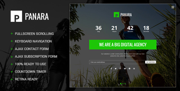